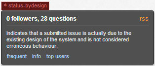
When highlighted because the mouse moves over them, the “status-bydesign” tag and some others turn into a weird and unreadable combination of colours: black text on maroon background. Here's an example:
As such, I find it unreadable.
I can read it, and it doesn't really bother me; but I suppose a lighter red would be a small improvement.
I'm not sure how meta works, and this bug report hasn't gathered a lot of interest. I wonder if I'm supposed to write an answer here, saying
yes, please fix it
so that people can upvote it and the bugfix will come :) I'll make it community wiki, so people can edit/remove it if that was not the right thing to do!
Looks like this got fixed at some point in the last, uh, 3 years:

Better late than never, right? :)
color: #FFFFFFor even an orange of the same color as the star next to the text (roughly #B14C45) to the style rules for that selector to improve readability. The rest of the site is graphically quite good, so I'm sure this was just someone's tiny oversight.