9

The new theming does not seem to be to anyone's taste, but we can't go back to the way the site used to look. Some features like fonts and page layout are now set across all sites, and we just have to live with what we've got. However, as a trade-off there is an opportunity here to add design elements in places that previously were almost design-free.

This question is specifically about the borders of the site: the top banner (not the black bar with the icons, the one below that where our site name is), the sidebars/background, and the footer. These can be customized within certain restraints (which can be found in more detail in Catija♦'s announcement here).

Header: The site name must be left-aligned—unfortunately, our lovely logo with the site name centered won't work with the new theme. Any additional graphic will be placed on the right side of the banner, and will slide over and then disappear as the window is resized. For is currently that just means that the "anchoring bar" on the right gets shorter, as we don't have a graphic other than the box around our name and the bars that stick out on either side.
Role-Playing Games.SE header at various widths, from widest with image right-aligned to narrow with image behind title to narrowest possible width, with no image (click image to see full size)
The background for the header can be part of the background of the sidebars (as in the RPG example above), or its own separate element.

Sidebars: The text has to be in black, so the background has to be light and un-busy enough to accommodate that. On some sites the background seems to be static, so that the pattern or fade doesn't change as one scrolls down the page; on others, the background seems to also scroll.

Animated gif showing background scrolling in Worldbuilding.se Animated gif showing static background with other elements scrolling in front in Puzzling.SE (click to see larger scrolling versions of these)

Footer: The text color options seem to be more variable, so there are more color choices. Again, this can be a continuation of the background in the sidebars or a separate element. The footer can include an illustration, either behind the text if it's legible or "intruding" into the top (as in Worldbuilding) or bottom of the box.
Footer of Travel.SE with globe illustration behind text Footer of Arqade.SE with video game illustration at bottom (click for full size)


So, the question: What could we do with our title banner, sidebars (or background) and footer to improve and extend the theming of the site?

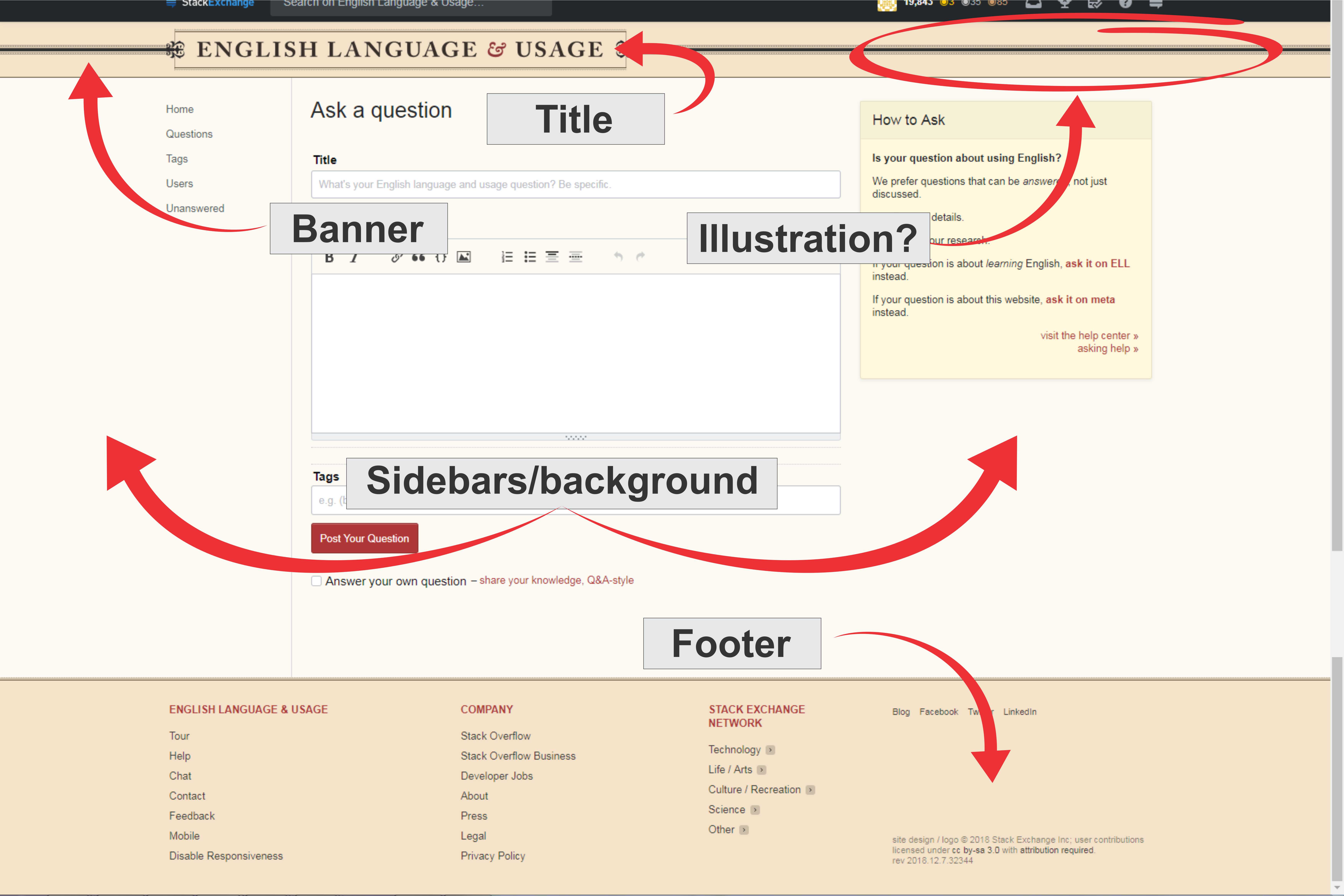
Image of current EL&U theme with Title, Banner, Banner illustration, Sidebars, and Footer labelled

7
  • 2
    Wonderful post. Wonderful, wonderful. Thank you for posting!
    – Mari-Lou A
    Commented Dec 8, 2018 at 1:10
  • 1
  • Best add that "we" can change the logo/banner but not its position. I thought this was common knowledge by now but not everyone reads every response to every announcement made on Meta or on EL&U meta.
    – Mari-Lou A
    Commented Dec 10, 2018 at 8:46
  • FWIW, my main problems with the redesign are use (usability), not appearance. How to find things, how to get around, ease of use. The feel is important to me, the look is less so, though I do agree with complaints by others regarding the new look. How professional UX designers can make it harder for users to use a site, in the interest of consistency or fashion or whatever, is beyond me. Make it usable first; then we can talk about ugly.
    – Drew
    Commented Dec 12, 2018 at 23:35
  • 1
    @Drew I tend to agree, but I don't think most of the elements that contribute to usability are up for discussion now. It would be great to have more questions addressing any elements that could affect usability and that are still changeable at the site level (color scheme comes to mind). My suspicion is that this is likely to be our last opportunity to have input on the look and feel of the site for quite a while, so I'm hoping we can spruce things up a bit before SO turns it's attention away from site design.
    – 1006a
    Commented Dec 13, 2018 at 3:17
  • MOBILE!!!! (Since that's all I use) Commented Aug 7, 2019 at 21:02
  • Aww, didn't see 2018 :( Commented Aug 7, 2019 at 21:14

4 Answers 4

5

One possibility: Make the page look a bit like an illuminated manuscript. An "illumination" illustration in the side bars in some kind of low-contrast, light-on-light pattern could coordinate with a more elaborate, potentially more highly-colored illumination in the top bar. Illuminated manuscripts aren't specifically English, so perhaps we could especially draw inspiration from the nineteenth century illuminations of William Morris:
Image of William Morris's title page illumination of the works of Geoffrey Chaucer (See at Wikimedia)
This style would lend itself to our existing color scheme; the banner could remain black-on-buff with red highlights, and the side bars could perhaps be something like buff-on-cream. We probably could also incorporate some part of the existing decorations into the pattern, or riff on the iconic ampersand, if we wanted to.

Most of Morris's work is out of copyright now, so we could borrow pretty freely. If an actual artist were designing something from scratch, I'll note that rhubarb apparently stands for "advice" in the language of flowers, so if we wanted to include a leaf motif rhubarb leaves might be apropos.

4

I think rich banners make the new theme work much better visually. Have a look at the following:

These seem to fit in much better with the new theme than our much-adored but now overstretched text-and-tape. In contrast, look at the following text-dominated beta sites - they look clinical and unappealing:

Even fairly 'small' or plain graphical elements can help:

For EL&U, consider using a (faded? beige? sepia? wood-dominant?) picture of an old library.

Here's (a link to) a collection from shutterstock. The expansive panorama of the Rijksmuseum Library gives a flavour of what I'm talking about. (Please excuse the lack of pictures; I'm not familiar with shutterstock's policies regarding reproducing images on unrelated sites.)

Having an olde worlde picture as the banner would also lend a touch of class to the site, perhaps subtly encouraging questions and answers to live up to it.

1
  • 1
    Yes, in a now-deleted question I also pointed out the new design is more forgiving to other themes that to ours. I also mentioned ELL and Travel, the former has that nice mint background colour which acts as a pleasant contract, while the latter site has that colourful compass symbol which lifts the entire website. Travel SE's original theme was quite gorgeous I thought, what we see now is a poorer version but it is still eye-catching. We need a graphic element and a new "wallpaper".
    – Mari-Lou A
    Commented Dec 8, 2018 at 11:55
1

Unfortunately, the modern interface does not lend itself to images of delicacy, and ornate details. The layout is an asymmetrical container, the logo must be positioned to the left and the left navigator is the default when a visitor joins the site. The icons on the top bar (Yes, we know this cannot be changed…) are not placed in a symmetrical or aesthetically pleasing order. Thus the banner and the side panels/background need to counterbalance this disequilibrium OR embrace it.

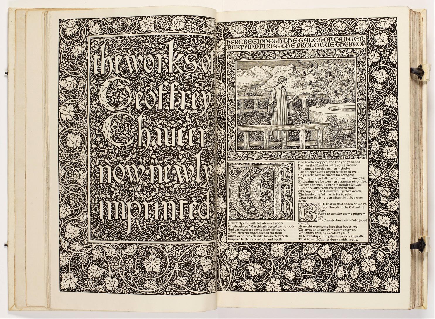
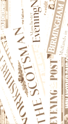
So, inspired by the theme of "words" suggested by 1006a, I was thinking maybe mastheads taken from different newspapers across the world, e.g. the US, the UK, Australia, Canada, and India. This would illustrate how English is a truly International language. Newspapers are vestiges of the past but the English used is (usually) standard, modern and extremely flexible as can be seen in headlines. With skill, creativity, sensitivity and the right editing tools, I believe my proposal could work.

Although I tried searching online for a collage of International English newspaper mastheads, I didn't find any at all and I do not possess a photo editor that allows me to fade the images as much as I would have liked to, so please use your imagination.

   enter image description hereenter image description here

Source

   
Source

3
  • This is fine if you don't have to have type over the background. If you do (and even if the BG is ghosted), it will be hard to read.
    – Robusto
    Commented Dec 10, 2018 at 15:06
  • @Robusto I don't think anything is written over the B/G, I was thinking of ELL 's. instead of computers and globes, we could have famous mastheads. The colors in the banner and B/G could evoke the palette used by WSJ or The Financial Times.
    – Mari-Lou A
    Commented Dec 11, 2018 at 10:49
  • 1
    @MariLou I think some tiny disclaimer text sometimes is. I saw a meta post on another site addressing it - I'll try and find. Commented Aug 7, 2019 at 21:03
-1

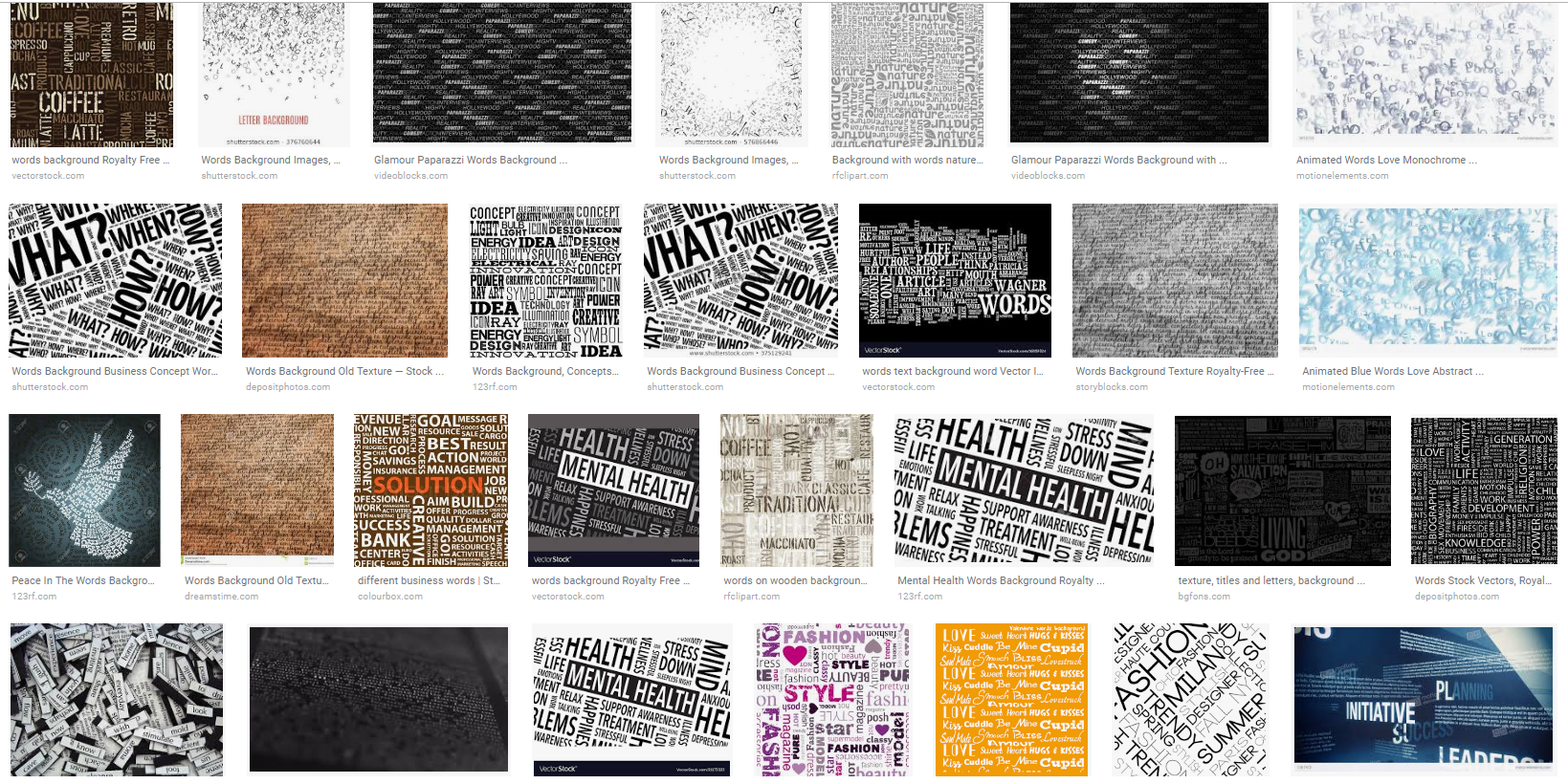
A second possibility: Do something with words or dictionary entries as an all-over-pattern in the sidebars in a light, low-contrast color scheme. It could be an image from an old (out of copyright) manuscript, or something more modern like a word cloud (perhaps with some of our tags as the component words). A quick google image search suggests some of what I'm thinking, though we'd probably need much lower-contrast than most of these for the sidebar:

Google image search results for "words background"

This could perhaps be combined with Lawrence's suggestion of a library image in the banner.

1
  • I think this selection will be considered too vast and not specific enough by the Community Manager, but let's see what she says. I like the concept of sepia toned 19th Century newspaper print as "wallpaper". It could include articles/headlines/titles from the New York Times, the Washington Post (USA), The Times, The Guardian (UK), The Times of India, The Sydney Morning Herald (Aus), and the Irish Mail or the Irish Sunday Times. To show that English is International
    – Mari-Lou A
    Commented Dec 10, 2018 at 8:58

You must log in to answer this question.

Not the answer you're looking for? Browse other questions tagged .