31

Hi all, I am Jin. I'm the designer who works on the design and CSS conversion for the Stack Exchange sites as they graduate from the beta phase.

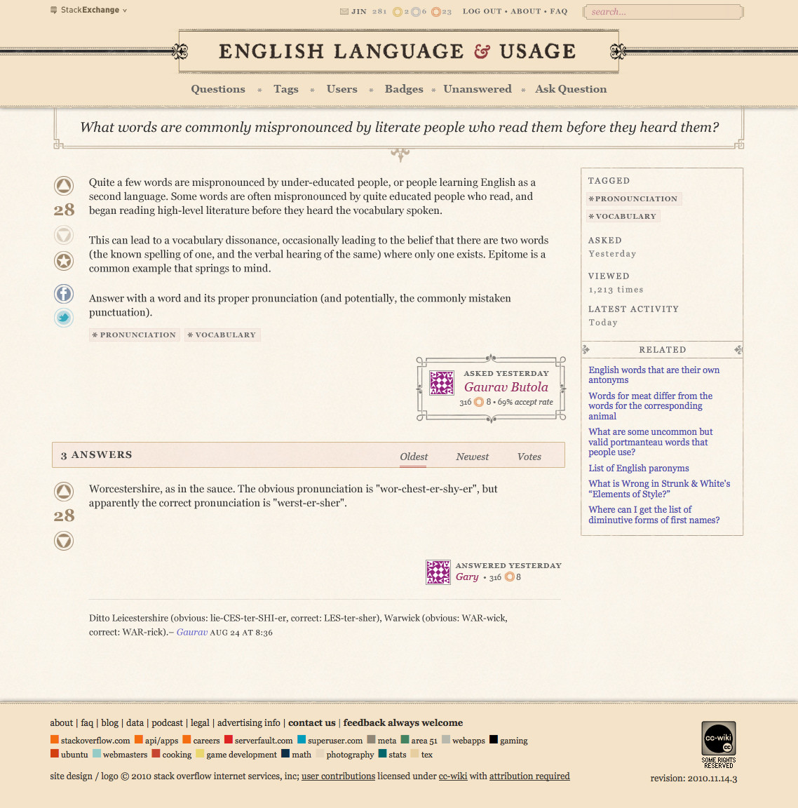
I'm very excited about the design for the English site. The English language has a long and rich history, and I wanted the design to reflect that. Instead of designing the site myself this time, I decided to commission a talented designer who's much more suited for this particular site design. I've been a longtime reader and admirer of Alex Charchar's design blog and work, so I'm very thrilled to have him working on this project.

Alex and I agreed on the design direction for the site. It should feature beautiful typography and invoke a vintage/warm feeling.

Click on the images to see the full resolution versions.

alt text

alt text

The header and subtle details throughout give the English site a unique look from the other SE sites. The body section has the same layout as the Beta theme; the goal is to make the main text clean and readable.

I'm very pleased with Alex's design, I hope you are too.

Please let me know your thoughts.

5
  • 13
    Just wanted to say: nice work!
    – Kosmonaut Mod
    Commented Nov 17, 2010 at 15:25
  • 1
    Wow!. i have been waiting for this thread for sooo long
    – Midhat
    Commented Nov 18, 2010 at 7:40
  • Another "NICE WORK!" and thanks! and a hearty pat on the back!
    – jcolebrand
    Commented Nov 18, 2010 at 21:15
  • That is awesome; very stylish indeed! Commented Nov 18, 2010 at 23:27
  • Wow, the older graphics were so much nicer that what we've moved to. :(
    – Davo
    Commented May 13, 2021 at 20:22

9 Answers 9

11

At the risk of being a stick in the mud, I wanted to voice my concerns with the site design. I feel like this "vintage" feel implies an "vintage" or "old-timey" approach to questions of English Language and Usage, which is the opposite of how we actually go about the business of answering questions of English Language and Usage. Generally speaking, the highest-rated answers are ones that take an evidence-based, descriptive approach to answering questions rather than an old-fashioned curmudgeonly prescriptive approach.

I fear that by adopting the proposed site style we run the risk of misleading new visitors that we are a bunch of obstinate old fuddy-duddies who reject anything newfangled and eschew modern approaches to linguistic questions.

5
  • I had the same concern. As much as the Victorian styling is a nice aesthetic, I, too, worry that the antique feel provides the wrong impression.
    – res
    Commented Nov 19, 2010 at 21:43
  • I think that the combination of vintage look and modern content will be really cool. But I agree with you about the impression which this style may give to new visitors. Commented Nov 20, 2010 at 2:54
  • 4
    I suppose you make a good point. I do think there might be a nice middle ground; the use of serif font, for example, seems very fitting. Perhaps the aspect that pushes things over the top is the overall color scheme?
    – Kosmonaut Mod
    Commented Nov 20, 2010 at 16:56
  • 1
    the design goal was to make it look classy, but not in a suffocating way. I can see where you are coming from. Perhaps the overall color scheme is a bit much. To strike a balance, what do you think if I lighten the body background and adding some sans-serif to meta text?
    – Jin
    Commented Nov 21, 2010 at 3:13
  • @Jin, now that I've had a chance to reflect on the two changes you suggest, I think that adding some sans serif to the design would do a lot to pull it out of seemingly intentionally 19th century time of grammar fussbudgets and make it feel more modern.
    – nohat Mod
    Commented Nov 22, 2010 at 3:01
7

I just wanted to note, for the record, that the handling of the chat UI is really very fine. I especially like the way avatars float down or drift off, depending on whether a user has entered or left the page, and how the alpha transparency degrades in proportion to the amount of time since that user has spoken in chat.

I'm a UI design engineer and I tend to notice nifty little details like these. Too often designers only hear what people don't like, so here, for what it's worth, is one very strong up-vote.

I also love the seamless integration with Wikipedia and YouTube APIs.

Very well done. Bravo!

2
  • 1
    +1. Heartily seconded! I’m not a professional like @Robusto; but I do love nice details and chafe at imperfect ones, and this site has many more of the former, and fewer of the latter, than most.
    – PLL
    Commented Feb 7, 2011 at 5:12
  • 1
    thanks for the kind words. All Chat UI goodies were done by our talented Ben Dumke. blog.stackoverflow.com/2010/06/… He does the theming for all of our sites' chat rooms.
    – Jin
    Commented Feb 7, 2011 at 17:00
4

There's a bit too much ALL CAPS text. Tags, in particular, really don't need to be in all caps.

Edit: another nitpick - I like how the ampersand in the site name is a different color, but I don't see that color used elsewhere on the question page. I think the user names on the main page are that color, but even there, the "Welcome New Users" text is a slightly different shade.

1
  • 1
    good points. I'll tweak the design accordingly.
    – Jin
    Commented Nov 18, 2010 at 15:15
4

Have you (accidentally?) UCased all the user names on the questions in your first screen-shot? (but not for the recent badges, nor on the question page)

4
  • 4
    Oh, I didn't even notice that. Changing text to all caps is generally a bad idea, because it loses information. So all-caps headings (whose text presumably is in the designer's control and, more importantly, does not change) are fine, but user names, tags, question titles, etc. should all retain their original capitalization.
    – Marthaª
    Commented Nov 18, 2010 at 15:22
  • 1
    @Martha: If I am not mistaken, tags are case-insensitive and therefore converting it to the upper case does not reduce information. Other than that, I agree. Commented Nov 20, 2010 at 2:49
  • 1
    Good call. I'll tweak the design accordingly.
    – Jin
    Commented Nov 21, 2010 at 3:08
  • @Jin: You should have used smallcaps for the tags, but full caps where the fullcaps parts go. It would look classy.
    – tchrist Mod
    Commented Feb 27, 2012 at 1:46
2

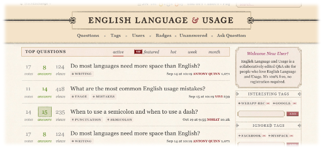
I have one minor suggestion. Could you try aligning the "Top Questions" bar with the boxes on the right? The following area in the current design makes me feel slightly uncomfortable:

alt text

I do realize that I will never see that "Welcome New User" box at all. However, I will see the "Interesting Tags" in its place, which is surrounded by a border as well (as opposed to WebApps, where there's no box around "Interesting Tags", so I have no quibbles about the box around "Top Questions"). So, what I have in mind is this:

alt text

Or perhaps you could even drop that box/background altogether (I know I'm not being original here, that's what most of our siblings have):

alt text

Hope that makes sense. Either way, thank you for your efforts.

1
  • 1
    @RedDwight, I agree with you on the alignment. In fact when Alex sent me the first mockup, he did have the sub nav go all the way across the site above the sidebar. But if you look on the homepage of our sites, the HTML isn't structured that way that's why I had to tweak it. (This is only on the homepage, on /question pages it does go all the way across.) I think I can take out the background color though, as you suggested.
    – Jin
    Commented Nov 17, 2010 at 16:18
1

From a pure usability perspective, I strongly favor a white background (rather than the off-brown) for the majority of the text area. The color in the header is fine.

-1

I personally love the body layout. The header, however, I think resembles TeX SE a little too much with the color scheme and the lines leading in from both sides.

It may just be me though—looking at them side by side shows the differences, but when you're only looking at one, it seems a bit easy to be confused if it were just a quick glance.

2
  • 3
    I can see where you are coming from. Both sites share a few similar design elements because we're going for a classic look. I think it's OK. Each site looks distinct enough to be on its own.
    – Jin
    Commented Nov 17, 2010 at 16:15
  • 1
    I don't see the problem here. I prefer it for the site. I like it, leave it!
    – jcolebrand
    Commented Nov 18, 2010 at 21:14
-1

Just a note to say I'm not sure about the current badges icon, I think the ones in your mock-up were slightly better.

I don't know why (maybe because they are shaped like targets?) but they make me want to click and expect to go somewhere (as if it were a notification).

Just my two cents :)

-3

can we make it a little more - medieval. Maybe by making the borders more stylized, like using a design instead of straight lines on the boxes

3
  • 5
    Medieval: did you mean the borders moat stylized? :)
    – Benjol
    Commented Nov 18, 2010 at 10:25
  • corrected. I want the site to have a 1600's feel
    – Midhat
    Commented Nov 18, 2010 at 15:37
  • 9
    I'd call the 1600s baroque, not medieval. :)
    – mmyers Mod
    Commented Nov 18, 2010 at 20:37

You must log in to answer this question.

Not the answer you're looking for? Browse other questions tagged .