4

I just took a look at https://english.stackexchange.com/review, and there's an oops:
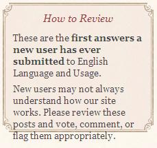
the last line of text doesn't fit in the box

4
  • 3
    I suppose I should have added a nice red freehand circle, but I'm too lazy.
    – Marthaª
    Commented Jan 11, 2011 at 23:37
  • 1
    I'll put in a fix for this soon. I'll reserve the "fancy box" for new user greetings only. For the Review tip box, I'll make it to have the same styling as the tip boxes on the Ask Question page.
    – Jin
    Commented Jan 12, 2011 at 9:07
  • nobody said that it must be nice. Or red, for that matter. (It can be green and completely fall over.)
    – RegDwigнt
    Commented Jan 15, 2011 at 19:00
  • @RegDwight: Really? Nobody said they have to be red? (And you're sure that's not just an unwritten rule?)
    – SamB
    Commented Feb 11, 2011 at 6:04

1 Answer 1

1

I see that too, but only at some font sizes. When I go from smaller font to larger, I get this: ... bad-good-bad-bad-bad-good-bad... that is probably why this was overlooked.

You must log in to answer this question.

Not the answer you're looking for? Browse other questions tagged .