1

I'm reviewing a participant's first attempt at an answer, and I don't know where to send her for help. Many of us arrive at EL&U totally unaware of "Meta" and how to find information about asking and answering questions. I've been active since last November and it still took me a few minutes to find information on what makes for a good answer (information that is outdated and far "looser" than what is actually enforced, by the way). As it is, it is just too difficult for beginners to find out how to begin at EL&U and ELL.

EDIT 8/1/16: Thank you all for pointing out the little help v on the black bar between review and Search Q & A in the upper right corner of the main screen. I feel foolish for never having noticed it. It would be so much more clear and helpful if there were a button to the right of Questions / Tags / Users / Badges / Unanswered and / Ask Question that was labelled Getting Started. It could have the same links as help v or (better yet) provide additional information and guidance for beginners and regular users alike (including information many of us need to be reminded of periodically).

On EL&U we now have more than 3200 unanswered questions (up from about 2400 eight months ago). Many of these are from first-time users asking questions that are poorly written and show no effort whatsoever at research. It would be helpful to be able to leave a comment stating, "Please click on the Getting Started button above and follow the guidance to improve your question/answer. Doing so will help others to provide you with more useful responses."

Is there any support for this idea?

5
  • 1
    I have a text file of canned responses that include helpful links, and I have marked a bunch of posts on the meta sites as favorites so I can get back to them easily. One thing I didn't know about were the link shortcuts like [help] and [edit] - you can find a few more (and test some things out) in the Formatting Sandbox on ELL's meta
    – ColleenV
    Commented Jul 30, 2016 at 22:19
  • Thank you, @ColleenV! Commented Jul 30, 2016 at 23:16
  • 1
    Maybe we should have a placeholder text in the answer box too Commented Jul 31, 2016 at 6:14
  • For new users, isn't there a banner at the top of the home page with the site tour? Can anyone confirm that?
    – Kit Z. Fox Mod
    Commented Aug 1, 2016 at 1:01
  • @KitZ.Fox There is a banner and you do see a "tour" link if you aren't logged in. It goes away once you log in - I suppose someone could go through signing up a new account to see if there is further prompting.
    – ColleenV
    Commented Aug 1, 2016 at 16:22

2 Answers 2

2

There's a help link right up top, to the left of the search box. How do you want it improved?

4
  • 1
    @MarkHubbard - I've known idiots. I worked with idiots. You, sir, are no idiot, not even close. I'm still finding things after years here, some obvious, some, not so much. Commented Jul 30, 2016 at 23:37
  • It could be improved by rendering it bold and capitalizing the first letter, and making those same changes to the review queue. That would make it more visible. I doubt we have independent control over it though, since it seems to be part of the standardized Stack Exchange interface.
    – Tonepoet
    Commented Jul 31, 2016 at 7:13
  • I think you offer some good ideas, but the header layout is sitewide, and this suggestion belongs at a higher level as the fix would impact all sites too. I'm in favor of making any user interface easier, more friendly. Commented Aug 1, 2016 at 14:34
  • Please see the edits to my question posted on 8/1/16. Thank you. Commented Aug 1, 2016 at 14:40
1

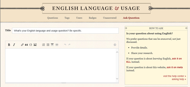
Actually, I was wondering how hard it was to find some guidance about asking, since I answer more than I ask on SE sites, and it turns out there is a lot of help to the right of where you're writing your answer:

Screen grab of 'Ask Question' page

I wonder if the guidance about "learning English" should also suggest Language Learning.

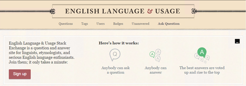
Here is the banner unregistered users see: enter image description here

Here is the top bar if you aren't signed in: enter image description here

3
  • Thank you, ColleenV, and +1 for introducing me to this screenshot. Even so, I don't think the information in the box is of much help, in part because "visit the help center>" and "asking help>" don't convey the concept of Getting Started on EL&U. Commented Aug 1, 2016 at 14:33
  • @MarkHubbard The sidebar was changed not all that long ago. I believe that the database column which holds it is not very large; what is there is just about as much as there could be (including markup). The two links at the bottom are standard across Stack Exchange: have a look at the provision on other sites.
    – Andrew Leach Mod
    Commented Aug 1, 2016 at 16:47
  • Thank you, Andrew. I'm sure that maintaining the many Stack Exchange venues is much more complicated than most of us realize. I certainly appreciate all the work you and others put into making these sites available to us. Commented Aug 6, 2016 at 18:59

You must log in to answer this question.

Not the answer you're looking for? Browse other questions tagged .