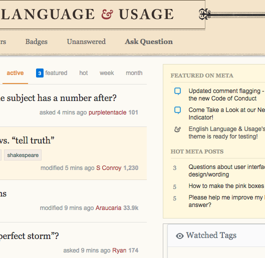
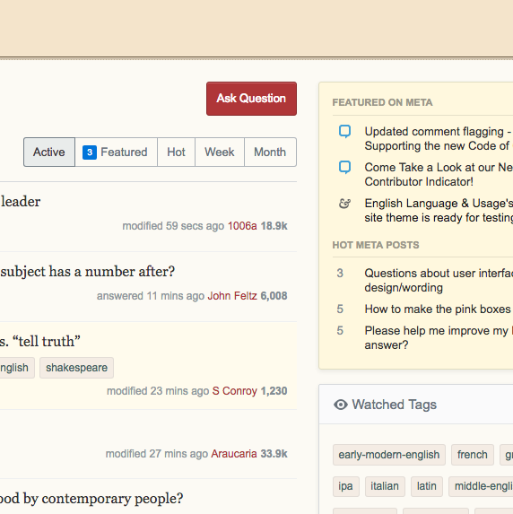
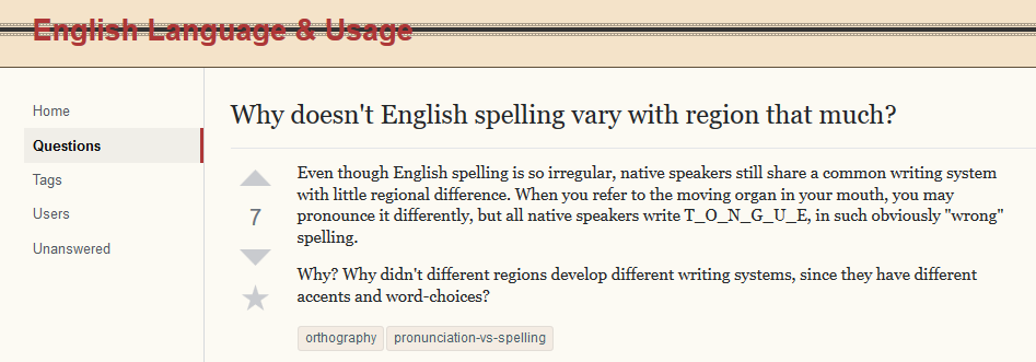
-23

As part of implementing the new unified themes across the network, we're gradually rolling out updated site themes for each site. As of today, we have enabled your updated site theme for testing.

If you can't see it right now, that's by design! We're hoping to get feedback from you before rolling it out to everyone permanently. If you'd like to review it, here's how:

How do I enable it?

Click here and check the "Beta test new themes" option. This will turn on the new theme for all sites that have one in testing, including this one. Here's more info on how to opt in. You can uncheck the box to revert to the older theme until the site is live for everyone (note, it will take a few minutes to go into effect).

What type of feedback do we need?

On this post: Bugs related to this site's design elements

Please help us look for issues/bugs related to the theme design and how we have mapped the old theme to the new. This needs to be done within the limits of the new unified theme.

On Meta Stack Exchange: General concerns about left nav or theming

If you have concerns or issues regarding the left nav or the overall approach we are taking to theming, then this Meta Stack Exchange post is the right place for feedback.

As you may notice, there are some unique design elements like voting arrows and tags that are being standardized in this process. Keeping these custom elements makes our ability to maintain the sites too complex and, while we're very sad to see them go, we're in a difficult position of needing to make the site designs work together so that we can continue to address feature requests and bugs that will make your Q&A experience better. This is addressed in a Meta Stack Exchange post if you want more detail.

What new themes?

If you're like, "What the heck are you talking about?", then you should read the Meta Stack Exchange post entitled Rollout of new network site themes (and maybe the posts it links to for the full background).

Thanks so much for your constructive feedback!

29
  • 23
    This would probably be better received if you guys could point out anything at all that actually looked better and provided improved functionality over the status quo.
    – tchrist Mod
    Commented Aug 31, 2018 at 20:29
  • 23
    I'm not entirely sure that slick is desirable. The site started out deliberately old-fashioned and fuddy-duddy for a very good reason, and that old-fashionedness helped when ELL started. This site is the gentlemen's club; that site is the school canteen. Both have their own clientele, and the design helps people decide which site is for them.
    – Andrew Leach Mod
    Commented Aug 31, 2018 at 20:54
  • 5
    @JJJ so apart from looking sleeker, where are the solid improvements? What has been fixed? What has facilitated the user's experience? Is it more intuitive than before? Have you tried leaving on the left navigation? Is that an improvement?
    – Mari-Lou A
    Commented Aug 31, 2018 at 23:19
  • 20
    @JJJ This is the whole point. There is no reason to change just to change. There is a reason to change if it's to improve. If it's to improve, then the improvements can be itemised and justified. Consistency is something that might be justified; so is difference (so that the difference between ELU and ELL is represented graphically, for example).
    – Andrew Leach Mod
    Commented Sep 1, 2018 at 9:13
  • 13
    Sorry, I can tell when it's change for change's sake. And I can certainly tell when a design is half-baked.
    – Andrew Leach Mod
    Commented Sep 1, 2018 at 9:20
  • 9
    No, I won't like it; SO has had this for some time. I might be content to live with it, but I believe it will be seriously counterproductive. Quite apart from the design inadequacies which are being rehearsed in answers here.
    – Andrew Leach Mod
    Commented Sep 1, 2018 at 9:30
  • 12
    In terms of graphic design, this is an amateurish disaster. The ampersand is the logo of the site: if anything it should be larger. The bracketing fleurons are meaningless. Flush left leaves no clear division of space. The mixture of serif and sans serif isn't a harmonious one. And I would love to get rid of the black bar.
    – KarlG
    Commented Sep 3, 2018 at 15:46
  • 8
    Oh, and the yellow used for the block quotes is both too saturated and dark. I just looked at one of my answers with lots of quotes and it was rather glaring.
    – KarlG
    Commented Sep 3, 2018 at 15:55
  • 5
    I realize that you are not responsible for the design's misgivings and maybe you cannot offer solutions that will appease, partially, our grievances, but I expected some form of interaction. Naturally, no one is blaming @Catija, and we all realize that this net-wide revamp was not undertaken lightly, but for those of us who are ignoramuses where computer programming is concerned, some form of exchange between users/contributors and management is needed. And I have seen Catija interact on the other beta testing sites, so why not here? Is it because the response here has been negative?
    – Mari-Lou A
    Commented Sep 4, 2018 at 5:25
  • 12
    How do you say "this all looks amateurish" and still be constructive?
    – Robusto
    Commented Sep 4, 2018 at 20:01
  • 8
    @Mari-LouA I work a job, like everyone who works here at SE and it's been a long holiday weekend full of 70+ pings from 9 sites that all had design announcements. I'm sorry that I wasn't interactive with y'all on a holiday weekend, particularly considering the people I'd be asking questions of are also on holiday. I respond to things I can. Lack of response is more indicative of me not knowing what to tell you than the general response here.
    – Catija Staff
    Commented Sep 4, 2018 at 20:52
  • 10
    @KarlG: I've worked in the business as a front-end developer for over 20 years. Before that I was a creative director, and dealt with graphic issues like type and color all the time. I know all the tricks, all the problems. What we had before here looked professional (even though it wasn't to my taste); what we have now does not.
    – Robusto
    Commented Sep 5, 2018 at 11:49
  • 5
    @Mari-LouA I've already said that I answer questions I know the answer to. As that comment on Monica's answer says, I'd just updated Andrew's answer to explain the changes that were being implemented. I don't have a full answer to that and I don't want y'all getting bad or conflicting information. These are rough designs that were released this way because they need work and our ability to test them without making them live is limited. This is why you have the option to turn it off. Please be patient.
    – Catija Staff
    Commented Sep 6, 2018 at 12:00
  • 8
    @Catija♦: I'm sorry you have to bear the brunt of all the criticism on a new design that you probably didn't make. I wonder why they asked you to post this, rather than someone who is actually directly involved in the design. At any rate, it is good to know that these are rough designs and by no means final. It might help, then, if and when you can find the time, to post your agreement or disagreement as to specific gripes posted in the answers, à la "yes, I see what you mean, I'll pass this on to the designers, I really hope they can fix this problem". For problems there are... Commented Sep 6, 2018 at 17:27
  • 10
    @user070221 It's not a waste of time because the look and feel of the site influences the community it serves. Of course, if SE have given up on the idea of community, then it might be a waste of time. Catija's comments on this question and answers suggest that it hasn't been entirely abandoned, so inviting contributions must be useful. And those of us who actually have experience in design might usefully contribute.
    – Andrew Leach Mod
    Commented Sep 8, 2018 at 10:25

26 Answers 26

47

Just because I want to be the first to say it. Me no likey :(

The original EL&U theme used to be beautiful. In 2010, the site's designer explained

“Alex and I agreed on the design direction for the site. It should feature beautiful typography and invoke a vintage/warm feeling.

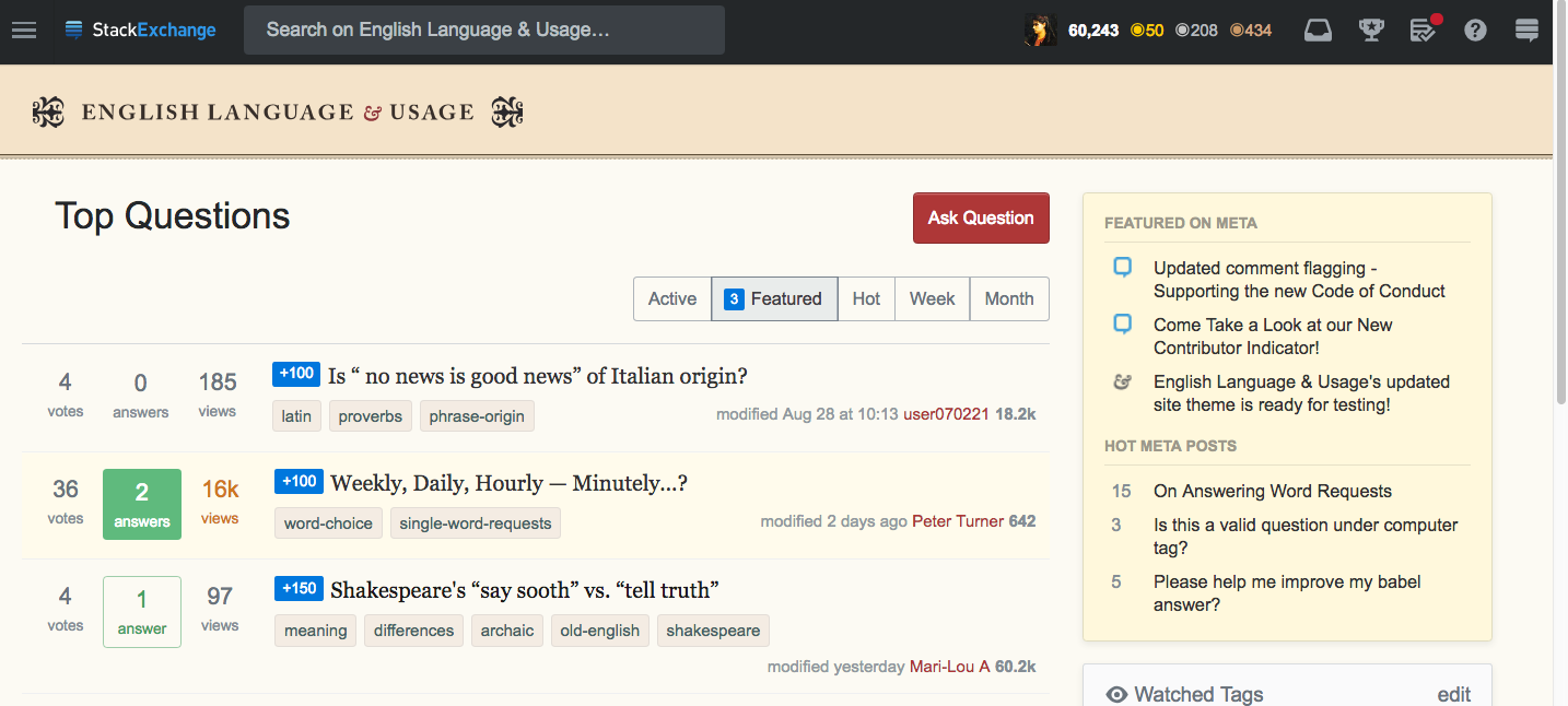
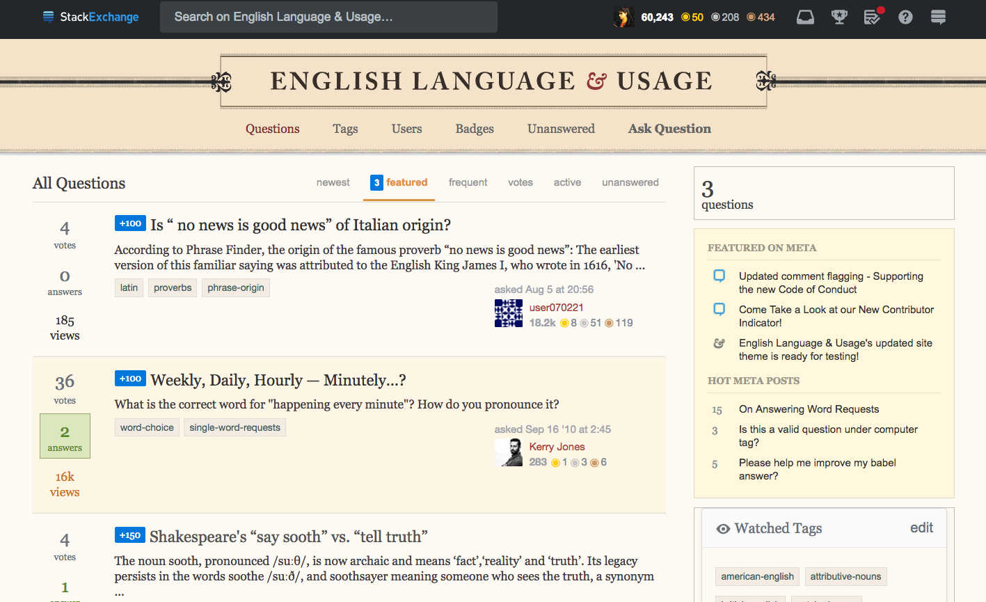
In 2018, the new flat theme is dull and one dimensional. The elegant Georgia font has been sacrificed. The quaint antique style and flourishes have been replaced by bands, lines and boxes. The theme colour, which was charming and reminiscent of a bygone era, now succeeds in accentuating this blandness.

Meanwhile, the always-awful jet-black top bar, which never matched the original theme, is unchanged. We are left with the main page resembling one of England's worst-tasting and garish-looking sweets (candy), the liquorice allsorts

Our once glorious ampersand (the Baskerville's italic ampersand symbol) has shrunk and become incongruous with its new austere surroundings. The website completely lacks personality and is superbly anonymous.

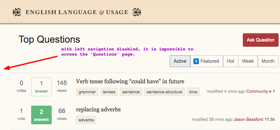
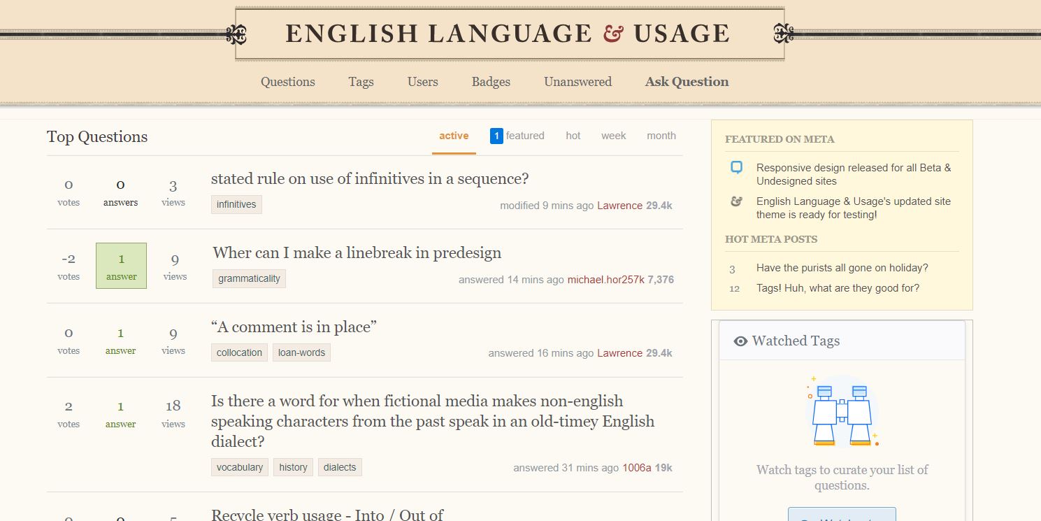
With the left navigation disabled

enter image description here

Here is the featured page (bounty page)

enter image description here

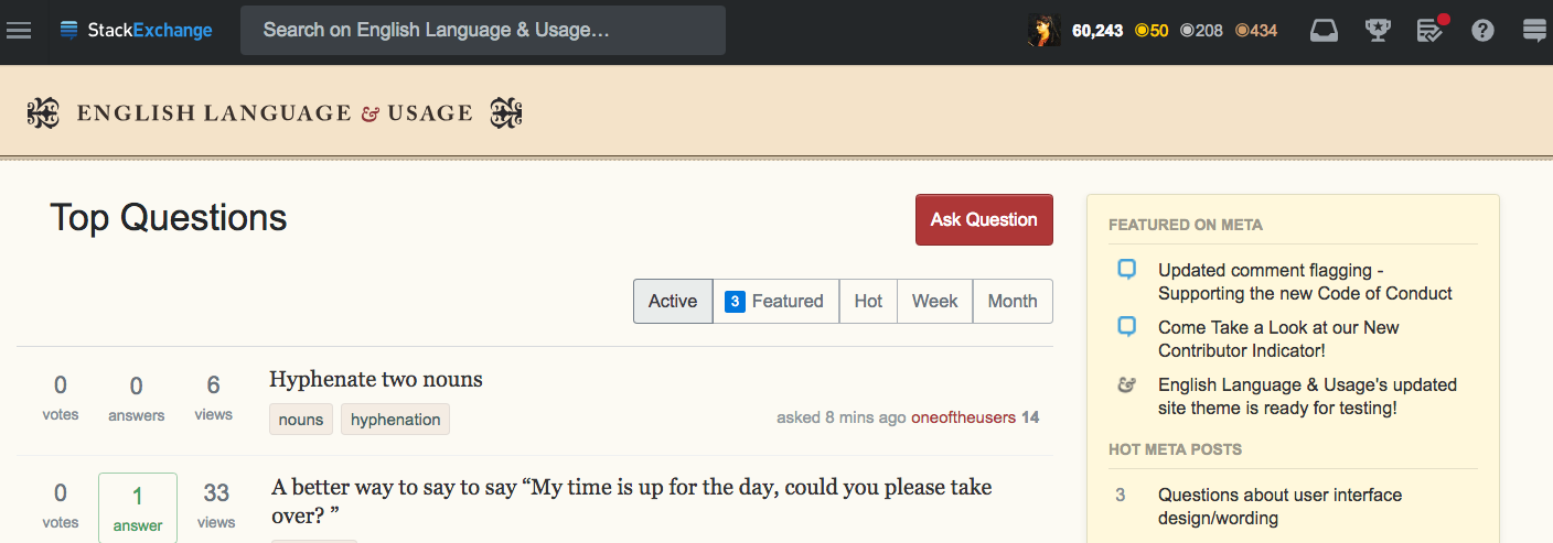
  • The heading ‘Top Questions’ is too obtrusive. It completely swamps the banner.

The "old" theme

enter image description here

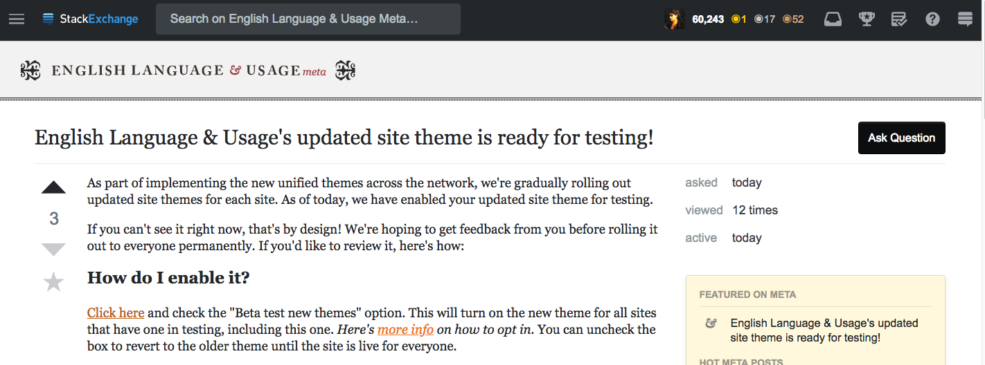
For some reason, I don't mind the meta page, maybe the grey matches the black top bar better

enter image description here

That last one seems an improvement but sigh we're losing our beautiful theme design and font. Sigh...

BUGS/DEFECTS

  1. Unless we enable the left navigation on the new theme, we do not see the preview of questions.

Previews of questions are not visible by design on the "home" page - the page that you get when you click on the site logo or the "Home" link in the left nav/left hamburger. This is the way the site has always behaved. If you want to view the Questions page, that's in the left nav hamburger dropdown or the left nav bar and you can see that view as you normally have. ~Catija

enter image description here

  1. With the left navigation disabled, there is no access to the ‘Questions’ page, which means...

This is incorrect. As stated in the previous note, this is in the left hamburger menu in the top bar. This menu is the left nav, in menu form. It only exists if you have left nav disabled or if you're viewing a page that doesn't have left nav at all. ~Catija

enter image description here

The links on the main page displaying badges, frequent, users and our greatest self-promotion asset, votes, are invisible. Casual visitors might risk not seeing EL&U's top questions and the corresponding top answers, which would be a disaster.

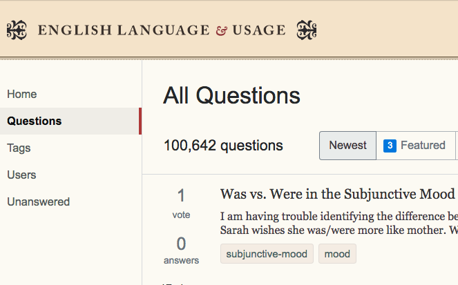
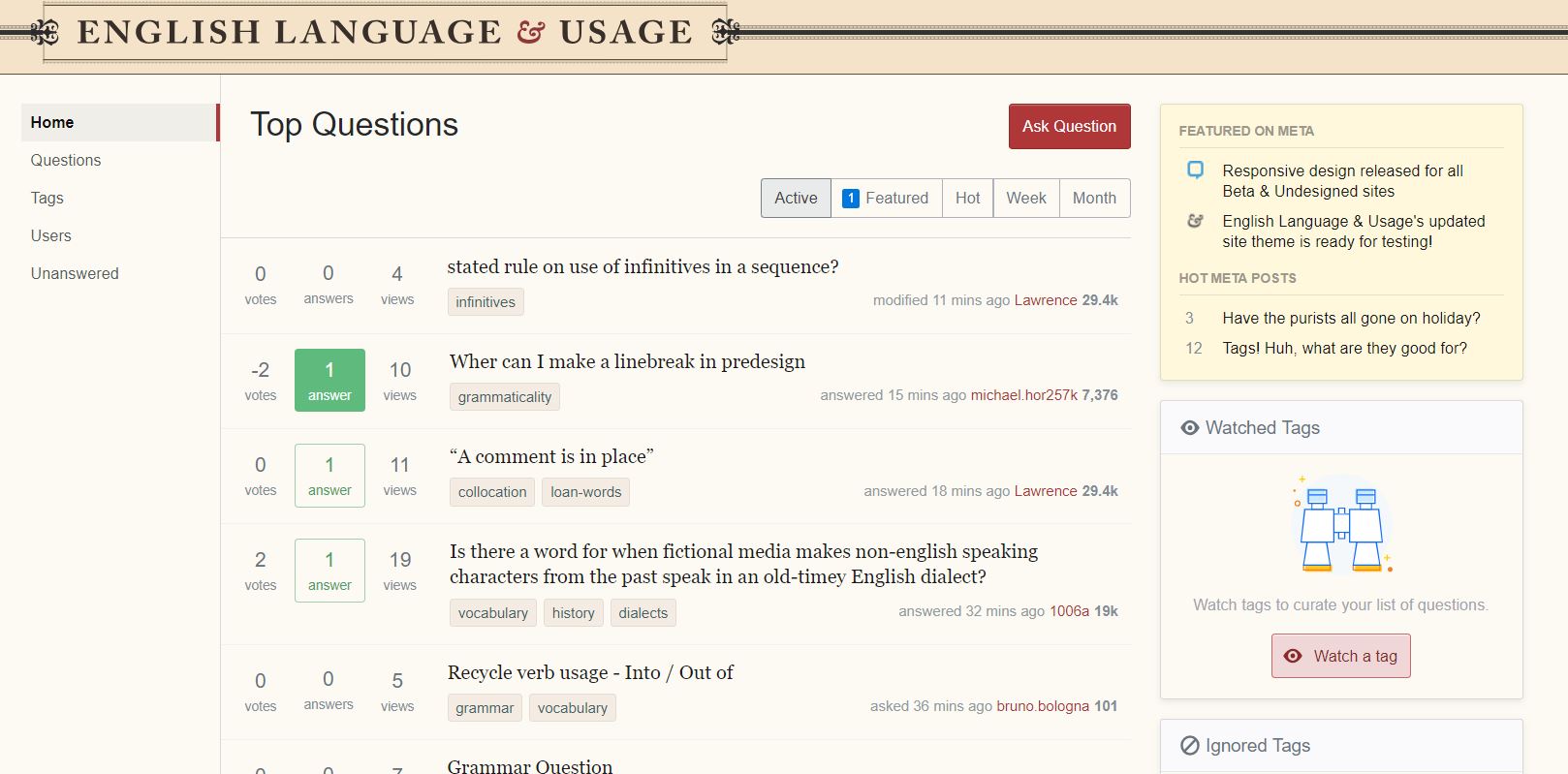
With the left navigation enabled

Access to Newest, Featured, Frequent, Votes, Active, and Unanswered is restored

enter image description here

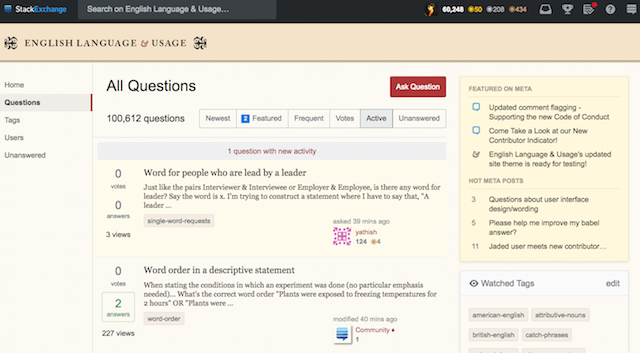
Here is a screenshot of the main page complete with left navigation and coal black top bar.

enter image description here

  1. Why is the web site's name pushed to the left?

Because all sites must have this placement moving forward. The goal of this update is to make the base LESS/CSS for the entire network as similar as possible, which requires that the logos all have the same positioning. Having these elements be the same makes it so that we can more easily roll out some of the feature requests that have been sitting around for years without risking breaking a chunk of the sites.

We made a similar but much more minor update back in 2015/16 but it wasn't enough to prevent bugs from happening constantly. It made it possible for the network to upgrade to new profile pages and other long-standing requests. Rolling out new features is fun but it's much less fun if you spend the next months fixing bugs because 60+ sites all have slightly different code bases. ~Catija

  1. Why is the subheading larger than the actual logo?

The subheading sizes are standardized across the network. Initially, the logo was somewhat limited by length relative to height in order for the logo to fit on phones as small as 320 px wide. Sites with longer names will tend to have smaller fonts to accommodate this. There are solutions for this that are being looked into. ~Catija

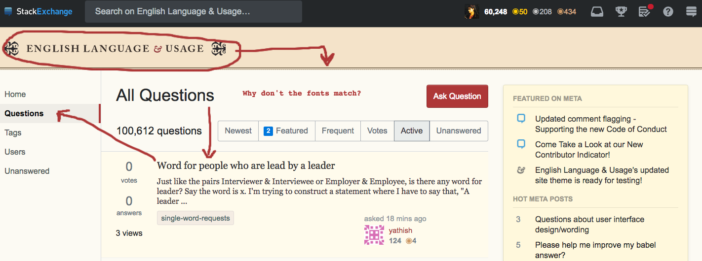
  1. Why do we have different fonts on the same page?
  2. What was the reason for downsizing the ampersand?
  3. Can we please eliminate, replace or shrink the ornamental floral elements to their former size?
  4. Will that dead space in the left margin one day be filled? Ads? Jobs?

There are a great number of plans for the left sidebar, many of which are yet to be decided or even thought of. We're absolutely open to suggestions for what to put there. Custom Question Lists are one of the things that will live there in the future. These elements, however, aren't complete yet and won't be available on sites until the left nav is on the site. As far as I'm aware, there's no plans to put ads in the left nav and Jobs content/ads, which only exists on Stack Overflow, lives in the right sidebar other than the link to the Jobs site. ~Catija

enter image description here

There is another way to access the questions page without enabling the left navigation, there's a hamburger menu (☰) on the top left of the page this allows you easy access to the Questions, Tags, Users, and Unanswered pages. I would recommend disabling left navigation and using the left hamburger logo/icon to switch pages.

  1. I do not understand why there are now three ‘hamburgers’, and why the hamburger on the left does not brighten when it is clicked. In my modest opinion, due to its gloomy appearance, it is easily missed and its utility overlooked.

enter image description here enter image description here

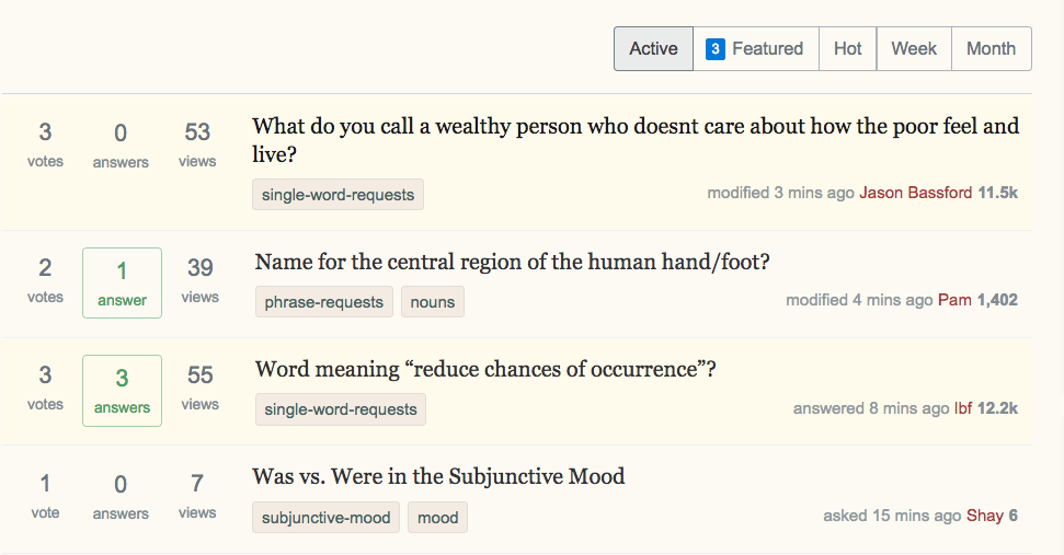
  1. Titles of Questions are not in red

When you visit a page, the question title is not red.

New Theme

(i) enter image description here (ii) enter image description here

Original Theme

(i) enter image description here (ii) enter image description here

I don't know if it is a bug or by design. Also worth pointing out, the new theme finds long titles particularly difficult to handle. See (i)


(Many thanks to @Laurel who showed me where to find the hidden hamburger)

14
  • 13
    Yeah, seriously, please bring back the question preview. ELU probably has the least informative titles on the entire SO network. Commented Aug 31, 2018 at 20:10
  • 1
    I think you're actually confusing two different pages here. There's the bounty tab on the home page and the bounty tab on the questions page. These lists are not always the same since the home page filters out heavily downvoted questions. It's an easy mistake to make (in fact I only know better now, after making this exact same mistake several months earlier).
    – Laurel Mod
    Commented Aug 31, 2018 at 21:26
  • @Laurel how do you return to the home page, once you're on the Top Questions?
    – Mari-Lou A
    Commented Aug 31, 2018 at 21:35
  • 2
    @Mari-LouA There's a hamburger menu (☰) on the top left of the page that expands the left sidebar. You can change this so that you always see the left menu by unchecking the hide option. See here for info on how to find this setting.
    – Laurel Mod
    Commented Aug 31, 2018 at 21:40
  • Actually we still have Georgia (font-family: Georgia,Times New Roman,Times,serif;) but Georgia may have been redesigned in the meantime. The main title went from Caslon Antique to a more modern Caslon lookalike when it was converted to SVG.
    – Andrew Leach Mod
    Commented Sep 1, 2018 at 7:40
  • But I'm not wrong when I say the headings "Top/All Questions" do not look like EL&U's traditional font. They seem to clash with the EL&U banner.
    – Mari-Lou A
    Commented Sep 1, 2018 at 7:44
  • Oh, yes: sorry, I didn't realise that was what you were referring to. Yes, everything which is not Georgia is Arial (on Windows; it might be Helvetica on a Mac).
    – Andrew Leach Mod
    Commented Sep 1, 2018 at 7:57
  • 2
    I can't bring myself to even look at the new questions and do some simple housekeeping. The colour scheme should be completely revamped, new colours should liven the main page, without some sort of makeover the site looks sickly. :(
    – Mari-Lou A
    Commented Sep 1, 2018 at 15:27
  • 1
    @AndrewLeach The font-path is the same even on a Mac, so it picks Arial before Helvetica: font-family: Arial,"Helvetica Neue",Helvetica,sans-serif;. Why they don’t swap the priority to put Helvetica Neue first I have no idea; Arial doesn’t even kern the e under the W in Week.
    – tchrist Mod
    Commented Sep 1, 2018 at 18:24
  • i.sstatic.net/wy0fH.png an OP page, dated 5 March 2015
    – Mari-Lou A
    Commented Sep 3, 2018 at 9:51
  • Do you have an image of the old (fancy, round) vote buttons where one of them is selected? (I certainly thought you did but apparently I'm not infallible.) Just curious to compare to what we have now and maybe get a little nostalgia.
    – Laurel Mod
    Commented Jul 2, 2023 at 19:05
  • @Laurel I have one from 2018, with an accepted answer which I upvoted, the buttons are round but not fancy. Maybe you're thinking back to 2015 or thereabouts.
    – Mari-Lou A
    Commented Jul 2, 2023 at 21:55
  • @Laurel I found the link! english.meta.stackexchange.com/questions/11806/…
    – Mari-Lou A
    Commented Jul 2, 2023 at 22:04
  • So I did remember correctly but was lacking in search lol. Look at that contrast!
    – Laurel Mod
    Commented Jul 3, 2023 at 0:25
39

See al­so these re­lat­ed and some­what more pa­tient MSE posts of mine:

  1. Why do some parts of the stan­dard theme use dif­fer­ent fonts than the rest of the site?
  2. Un­chang­ing font size, lead­ing, and mea­sure in­com­pat­i­ble with dy­nam­ics of re­spon­sive de­sign
  3. Ran­som-note prob­lems with IPA and Greek un­der new font stacks
  4. Track­ing set too tight on up­per­case text-trans­form CSS
  5. Ren­der­ing bugs with smart quotes in de­fault font stacks

As well as these very close­ly re­lat­ed posts of mine over on Graph­ic De­sign’s meta:

  1. Graph­ic De­sign up­dat­ed site theme is ready for test­ing!
  2. Ren­der­ing Re­gres­sion Bug
  3. Good para­graph-re­flows now

Dis­card­ing Geor­gia for Ar­ial is un­ac­cept­able

We’ve lost our el­e­gant Geor­gia face on most of the site. It’s been re­placed by Ari­al of all things. Those two faces are ɴᴏᴛ ᴍᴇᴀɴᴛ to go to­geth­er, and they do not. Geor­gia is sup­posed to pair with Ver­dana, not with Ari­al. Other­wise the char­ac­ter is all wrong, like chalk and cheese.

This im­pacts site us­abil­i­ty be­cause the x-height in Ari­al is con­sid­er­ably small­er than the one in Ge­or­gia for the same point size. That makes ev­ery­thing small­er and hard­er to read. Why would you de­lib­er­ate­ly choose to do that with­out com­pen­sat­ing for the new size? Notice how the small capitals that it pulls from Times New Roman are the wrong size and stroke width for the surrounding Georgia:

demo of existing paragraph with small capitals for ɴᴏᴛ ᴍᴇᴀɴᴛ part

If after click­ing on that im­age to see it at full width, its text still looks too small, that’s prob­a­bly be­cause the new “re­spon­sive” de­sign is not ac­tu­al­ly re­spon­sive enough to rec­og­nize large view­ports and re­size the type­face and ad­just the mea­sure com­men­su­rate­ly — and you’re us­ing a wide-screen mon­i­tor like I am. This is all cov­ered in the afore­men­tioned linked MSE post № 2.

Why this is a bad pairing

The ex­ist­ing site had a lit­tle bit of Ari­al, but the new one is most­ly Ari­al as I will show in im­ages be­low. Some have asked why it’s ug­ly to mix these. In The Ele­ments of Ty­po­graph­ic Style, Rob­ert Bring­hurst writes:

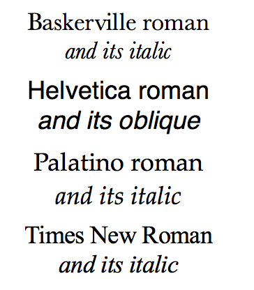
Us­ing what there is to best ad­van­tage al­most al­ways means us­ing less than what is avail­able. Basker­ville, Hel­veti­ca, Palati­no, and Times Ro­man, for ex­am­ple – which are four of the most wide­ly avail­able type­faces – are four faces with noth­ing to of­fer one an­oth­er ex­cept pub­lic dis­agree­ment. None makes a good com­pan­ion face for any of the others, be­cause each of them is root­ed in a dif­fer­ent con­cept of what con­sti­tutes a let­ter­form. If the avail­able pal­lette is lim­it­ed to these faces, the first thing to do is choose one for the task at hand and ig­nore the oth­er three.

Bringhurst specimen of Basker­ville, Hel­veti­ca, Palati­no, and Times Ro­man

About which he says the following (excerpts only):

  • Basker­ville is an English Neo­clas­si­cal face de­signed in Birm­ing­ham in the 1750s by John Basker­ville. It has a ra­tio­nal­ist ax­is, thor­ough­go­ing ge­om­e­try and a del­i­cate fin­ish.

  • Hel­veti­ca is a twen­ti­eth-cen­tu­ry Swiss re­vi­sion of a late nine­teenth cen­tu­ry Ger­man Real­ist face. ... The heavy, un­mod­u­lat­ed line and tiny aper­ture evoke an im­age of un­cul­ti­vat­ed strength, force, and per­sis­tence. The very light weights is­sued in re­cent years have done much to re­duce Hel­veti­ca’s coarse­ness but lit­tle to in­crease its read­abil­i­ty.

  • Palati­no is a lyri­cal mod­ernist face with a neo­hu­man­ist ar­chi­tec­ture, ...

  • Time Ro­man – prop­er­ly Times New Ro­man – is a his­tor­i­cal pas­tiche ... It has a hu­man­ist ax­is but Man­ner­ist pro­por­tions, Baroque weight, and a sharp, Neo­clas­si­cal fin­ish.

For rea­sons I won’t get in­to here, what he says about Hel­veti­ca you can ap­ply in equal mea­sure to Ari­al, and what he says about Times New Ro­man you can ap­ply to Georgia.

It’s fine to mix sans and serif for dis­tinct sec­tions (like cap­tions for ex­am­ple), but please pick two type­faces that have the same no­tion “of what a let­ter­form is.” So they should both be from the same tra­di­tion, in our case prefer­ably an old-style Re­nais­sance one with a hu­man­ist (oblique) ax­is, large aper­ture, crisp ter­mi­nals, and with an ital­ic equal to and in­de­pen­dent of the ro­man rather than just an oblique with a slant ver­sion of the same ro­man let­ters. And both should have old-style text fig­ures and such.

Georgia you can say much but not all of that about; Ari­al noth­ing. An ex­am­ple hu­man­ist pair­ing would be some­thing like FF Scala Sans to go with FF Scala. I re­al­ize those two in par­tic­u­lar are not avail­able to us, but they pro­vide a sound mod­el to em­u­late in pair­ing two linked faces done in the self­same hu­man­ist tra­di­tion.


Please put our el­e­gant Geor­gia back wher­ev­er you’ve smashed us in­to a bland sans, with­out even prop­er text fig­ures. Why would you change this:

old dup close

to this:

new dup close

It sticks out like a sore thumb now. It doesn’t make sense giv­en that we’re a serif site. This looks like a mis­take. It cer­tain­ly does not look good.

This is ugly and wrong for our site theme:
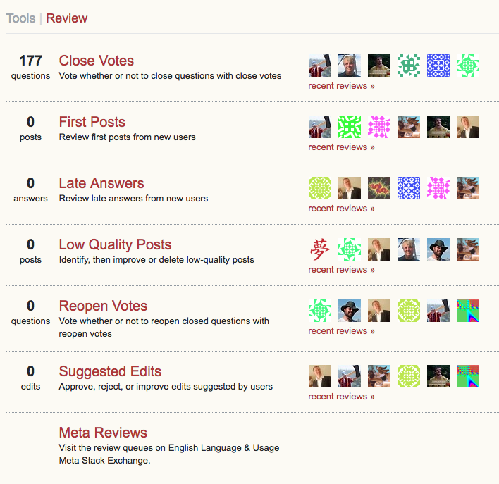
looks like shit

This is right:

looks right

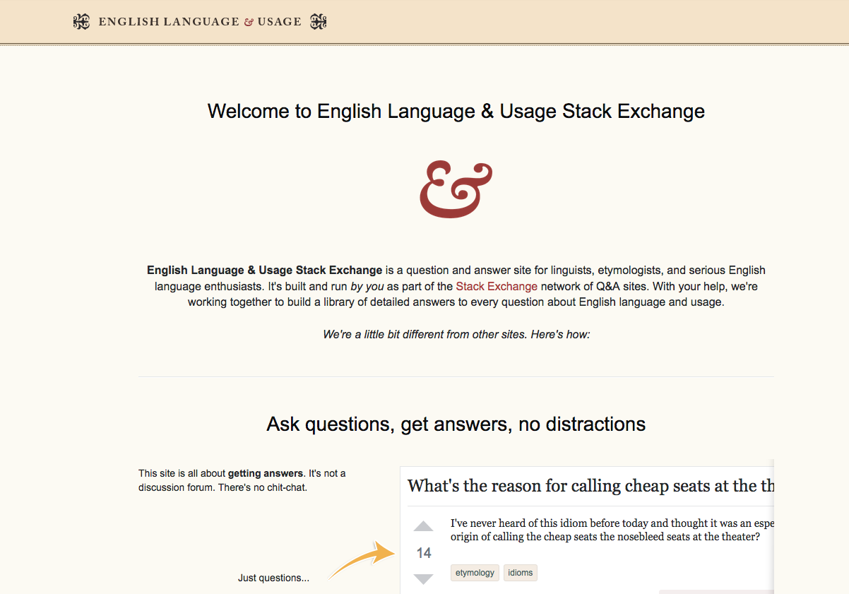
This is hap­pen­ing all over the place, from cra­dle to grave. So here’s what we used to greet peo­ple with:

old greeting page

But now they get this, which has noth­ing to do with our site:

new greeting page

Even the tour is all messed up. Where once we had this:
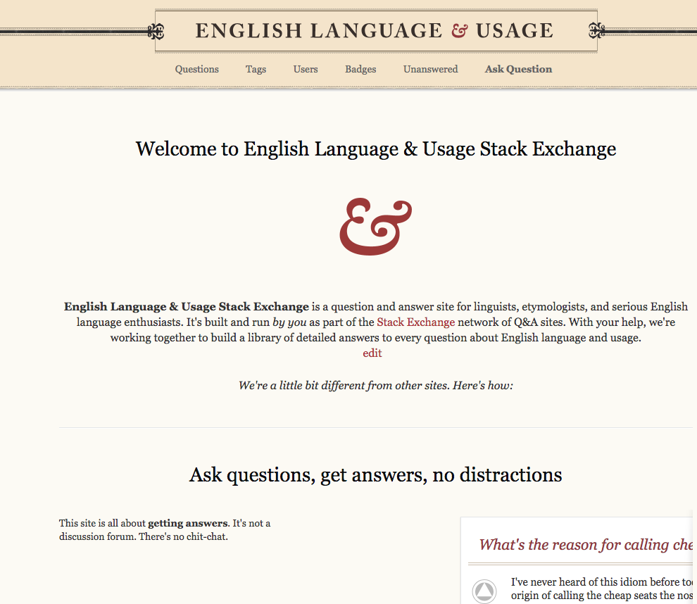
old tour

Now we have this, which again looks alien to the site theme, and there­fore un­wel­com­ing:

new tour

It’s al­so ly­ing: we aren’t dif­fer­ent from any­body else. We are ex­act­ly the same.

Now we don’t even have an ital­ic font. The new sans has no ital­ic on­ly oblique, so you don't have the right let­ter­form for the a, just an a that’s slant­ed. Use some sans that has a re­al ital­ic for good­ness sake!

And what hap­pened here?

new tag page

Is sup­posed to be:

old tag page

And what hor­ri­ble thing has hap­pened to all of our pro­files? This:

old profile

has become this:

new profile

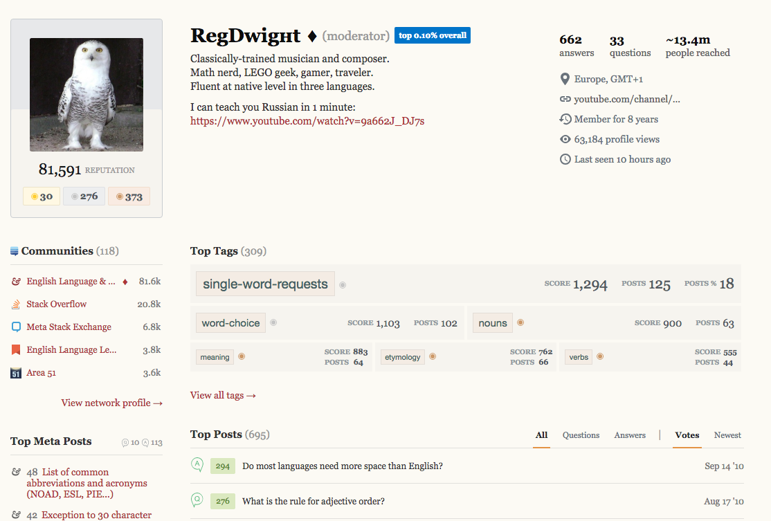
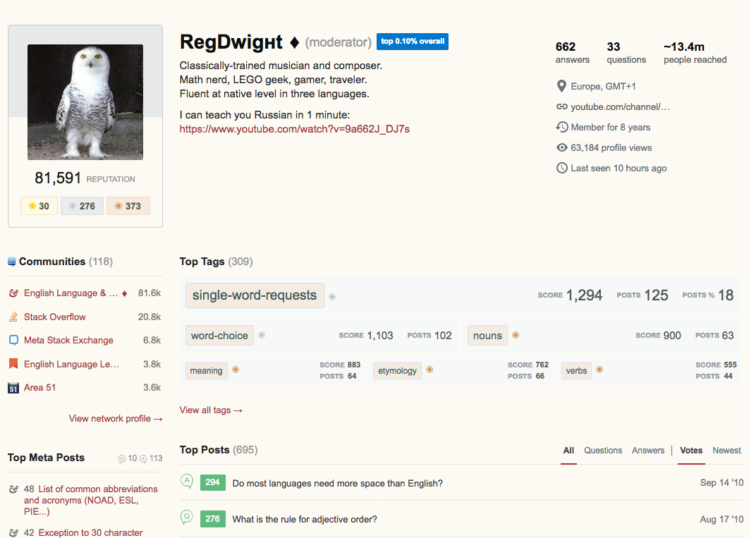
I don’t know what that stuff is, but it isn’t English Lan­guage & Usage. It’s com­plete­ly re­moved all site flair al­to­geth­er. This is just a beige ver­sion of Stack Over­flow. It is not taste­ful and it is not el­e­gant. It is the op­po­site of those things. Why? What does de­stroy­ing our fonts buy some­body that is so im­por­tant that we should suf­fer this ig­nominy?

This all seems care­less and wrong, a gross mis­take. It’s harm­ful. Why?

Geor­gia and Ari­al don’t even go to­geth­er. They’re from dif­fer­ent tra­di­tions. You need to pair one hu­man­ist/old-style face with an­oth­er. Or even a neo-hu­man­ist or tra­di­tion­al pair. But you don’t mix chalk and cheese. This is all out of whack. And no, you can­not pair Times New Ro­man with Hel­veti­ca ei­ther, for the same rea­son. Nei­ther of those sans faces pair with ei­ther of those serif ones. Please read Chap­ter 6 of The Ele­ments of Ty­po­graph­ic Style, “Choos­ing & Com­bin­ing Type”, for why this mat­ters.

Us­ing a sans font on ELU — in par­tic­u­lar, this new hodge-podge ran­dom mix­ing of Ge­or­gia and Ari­al with nei­ther rhyme nor rea­son — looks like crap. If we can’t have Geor­gia, just be hon­est and make it Com­ic Sans and watch peo­ple re­sign.

I’m se­ri­ous. Stick­ing us with some bor­ing, in­el­e­gant font that is not our site’s font is non-ne­go­tiable. We need no sans here any­where we didn’t have it be­fore.

This is ob­vi­ous­ly some­thing that can be fixed. And should be.

Plus for the sans, pick one that has an ac­tu­al ital­ic, not an oblique. Pick a serif and a sans that ac­tu­al­ly G O  T O ­G E T H E R for good­ness’ sake. That usu­al­ly means by the same de­sign­er, the way Geor­gia and Ver­dana were made to be paired.

Please restore all the new sans places back to the old serif!

30
  • 4
    @Mari-LouA I mean that they're using a lame sans instead of Georgia, which means that the numbers are now all columnar/lining figures. They aren't "text figures" where the 7 is below the 1 etc. It's everywhere except in the literal Q/A post. It looks terrible, but we're not supposed to want old style because we're NEW & MODERN Hallelujah. It's like getting comic sans rammed down your throat and told to like it or lump it. It's insulting to anyone with a sense of aesthetics about typesetting, like our new ransom-note logo on meta. Sucks.
    – tchrist Mod
    Commented Aug 31, 2018 at 20:21
  • 2
    +1 for "ransom note" :) Thanks for explaining what "text figures" are. Maybe you could post more examples of numbers, the screenshots weren't obvious to me until you explained.
    – Mari-Lou A
    Commented Aug 31, 2018 at 20:25
  • 9
    I love the effect that the Georgia font has on the tenor of this site, and I will be very sorry to see it supplanted by a merely functional sans serif font. On a site dedicated to words, the serif ornamentation doesn't convey fussiness or busy work but elegance and appropriate attention to detail; and a sans serif font doesn't convey vigor but lack of nuance.
    – Sven Yargs
    Commented Sep 3, 2018 at 20:11
  • 1
    @SvenYargs Thanks. I’ve added more images showing how dreadful the before-and-after is. It’s like our whole site theme has been discarded. Plus you aren’t supposed to pair Georgia (or Times New Roman either) with Arial: those two don’t go together because they are not from the same traditions. (Unlike say Georgia and Verdana, which were meant to pair up as serif and sans by the same designer.) And the so-called italic on this Arial is NOT an italic. It is merely an oblique. You can tell by looking at the a versus a <-- those are not supposed to be the same letterforms. Try Calibri instead.
    – tchrist Mod
    Commented Sep 3, 2018 at 20:25
  • 8
    I am out of my depth on the specifics of typographical design, but years of editorial work with some excellent designers in magazine publishing at least taught me to appreciate some of the thought that needs to go into a well-integrated, organically conceived design. (One of the things I learned was not to treat oblique as a handy shortcut for italic.) As you have detailed, the effort here seems to have been much closer to covering a stone façade with aluminum siding than to rebuilding a structure from the ground up.
    – Sven Yargs
    Commented Sep 3, 2018 at 20:38
  • 1
    Hello. I am finally communicating with Catija and asking if it is possible to remove the underline from links. I doubt it. Could you use your mad computing skills and find examples of posts where users linked entire passages? Instead of one or two words being linked, which is bearable, we will see entire paragraphs heavily underlined. That can't be right.
    – Mari-Lou A
    Commented Sep 4, 2018 at 12:44
  • 10
    This post on Meta lists Georgia as one of the options- it’s weird that it wasn’t preserved on ELU: meta.stackexchange.com/q/311033/273494
    – ColleenV
    Commented Sep 4, 2018 at 13:52
  • 4
    @JanusBahsJacquet: Tom is right. No self-respecting designer would ever use Arial (a text font, and a poor one at that) as a display font. It just wasn't designed to carry that kind of freight.
    – Robusto
    Commented Sep 5, 2018 at 12:27
  • 3
    @Robusto I agree completely with that (I wonder why Arial is listed before Helvetica in the CSS here; that seems sillily backwards). I was only reacting to the parts of the answer that deal with Georgia and Arial/Helvetica being of different types and not making a good pairing at all—that I don’t quite agree with, at least not for this site. But the excessive Arial-fest in the new theme is way over the top and needs to go, of that there can be no doubt. Commented Sep 5, 2018 at 12:29
  • 8
    @Robusto I don’t know that there’s any­body left work­ing at SE who even knows what a dis­play font is. All I see is CSS hack­ing, but no overt ev­i­dence of any ac­tu­al ex­per­tise in the art of set­ting type. The aes­thet­ics ap­pear ei­ther lost on them com­plete­ly, or else they sim­ply Dᴏ Nᴏᴛ Cᴀʀᴇ be­cause it is get­ting in the way of their pro­gram­ming ef­forts.
    – tchrist Mod
    Commented Sep 5, 2018 at 12:50
  • 4
    @Catija Are you saying that SE intends to force a Sans face on EL U all over the place where we used to have a Serif one, that this is by deliberate intent and so SE refuses to fix this? If so, then please don’t call it status-bydesign because that implies actual design principles were involved when they weren't. Call it at most status-wontfix. If I wanted that look and feel, I'd go to a beta site or Stack Overflow. Basically, we are all Stack Overflow now: please don't expect us to like that. I certainly do not. I'm not as interested in participating anymore and I hope you can see why.
    – tchrist Mod
    Commented Sep 21, 2018 at 21:18
  • 2
    If that's the way you want to frame it, that's your choice. Jon explains it better than I can. There are technical concerns that we may be able to overcome in the future but, for now, this is the way it's going to be.
    – Catija Staff
    Commented Sep 21, 2018 at 21:21
  • 4
    @tchrist: I had a conversation with the designer this week to sort this out for my own benefit. (We tend to trust our designers know what they are doing, which is, I think, appropriate professional courtesy.) The post on MSE is my summary of our conversation. I think it would be really helpful if you considered the argument I presented and propose a counter-argument. There's certainly time as we aren't going to change this while we're actively pushing out the theme to other sites. Technical arguments are especially useful.
    – Jon Ericson Staff
    Commented Sep 21, 2018 at 22:02
  • 3
    @JonEricson Even though Catija linked to it, I had not read the MSE post of yours that she re­ferred to last Fri­day. Without read­ing close­ly, let alone fol­low­ing her in­struc­tions and link, I had care­less­ly as­sumed that her link was in­stead to this old­er post of yours there. This mis­take is why I took um­brage: I wrong­ly thought I was be­ing point­ed at an ex­ist­ing gener­ic re­sponse, not a new, spe­cif­ic re­ply with tech­ni­cal ex­pla­na­tions. Please ac­cept my apolo­gies. Fur­ther re­marks I will post as a re­ply there.
    – tchrist Mod
    Commented Sep 25, 2018 at 13:54
  • 2
    @tchrist: No problem. I'm a lot less confused now. ;-)
    – Jon Ericson Staff
    Commented Sep 25, 2018 at 16:33
37

The contrast here on the "load new answers" bit is completely unreadable:

more shitty design

There are plenty of tools out there that tell you whether the contrast is tolerable or not. Please use them, because this clearly is not.

1
  • 7
    Our ability to test the site before rollout is ... practically non-existent, which is why we created this testing phase... to find exactly these sorts of things without it impacting users. Thanks for finding this, we'll be sure it gets fixed.
    – Catija Staff
    Commented Sep 7, 2018 at 16:55
25

There's a weird problem causing the offset letters in the banner. It's being looked at but will be fixed (on all of the sites getting hit by it). The status completed tag on tchrist's bug report was because the site theme was fixed back to what it was, not that this version of it was fixed. There was an odd slippage of the image for the new version of the site into the old/current site design - that's what was fixed.

As to the general banner, the placement of the site name has to be on the left, not centered, but I've seen a mockup of an updated version that I really hope y'all will like (more, anyway). It is, essentially, identical to what it currently is, but not centered. This includes making it slightly larger than the disliked version but still a bit smaller than the old, to fit in the new top bar height.

Well, tchrist's objection to the quality of the image has not been corrected, despite the [status-completed] tag:

New banner

The letters are all over the place (and why is meta set in Georgia rather than the title font?). It's better, but I would suggest still not right, in Main:

New banner

The ornaments cry out for centring, but everything is just pushed to the left. It's horrible. It's not just bland, it's cheap and nasty, and not a patch on the original design. That was centred and used a larger distressed font with authentic spacing and was obviously the work of a talented designer really well-designed.

Original distressed font

However, given that the overall concept is a done deal, however badly envisaged, I suppose we will need to make the best of it.

While I don't make my living from design, I think I would suggest losing the ornaments altogether. That will allow the lettering to be made larger, like Christianity's header, and possibly mean that Caslon Antique can reappear, too.

Christianity

It would be really good if something could be used on the right-hand side, like the Christianity cloud. Perhaps one of the ornaments could go over there — larger and cropped, as a nod to the old style? Or maybe an artistic scan of part of a page of H.W. Fowler's Modern English Usage, since the first edition is well out of copyright.

What is good is the decorated border, but it's not enough to detract from the overall blandness, I'm afraid.

13
  • 8
    Yes, without the bars and box anchoring the ornaments they now look like a couple of carnivorous plants trying to eat the title. Just get rid of them if they're going to float like video game monsters.
    – 1006a
    Commented Aug 31, 2018 at 20:27
  • 4
    The morning after... I hate the new theme. I don't think I want to participate on this website for much longer. I suppose the modernised site now matches the quality of the questions which assault us on a daily basis.
    – Mari-Lou A
    Commented Sep 1, 2018 at 7:09
  • 2
    @Mari-LouA Quite. Design can actually help that (see my comments under the question).
    – Andrew Leach Mod
    Commented Sep 1, 2018 at 8:19
  • 3
    Switching from Caslon small-caps to Georgia lowercase when going from USAGE to meta is really bizarre. I cannot imagine why anyone would ever do such a crazy thing — outside of a ransom note. :)
    – tchrist Mod
    Commented Sep 4, 2018 at 0:49
  • 1
    @Catija What about something at the right-hand side of the title bar?
    – Andrew Leach Mod
    Commented Sep 6, 2018 at 6:36
  • 2
    Oh, hey, looks like this is live now :D
    – Catija Staff
    Commented Sep 6, 2018 at 15:10
  • 6
    @Catija No, no, no! That's even worse and completely undermines the uniform simplicity the redesign is intended to introduce. You've lost the fancy line (applying it to the box) and gained a box and heavy lines which should anchor the box in the centre. As that's impossible, those heavy lines shouldn't be there. The ornaments will have to go because they need the box which doesn't fit the simple theme. So just go with the title with its signature ampersand, larger to fit the space and reintroduce the weathered font. That would provide space for a pictorial filler on the right.
    – Andrew Leach Mod
    Commented Sep 6, 2018 at 15:43
  • 4
    @AndrewLeach It'd probably be more helpful to us if we had a separate discussion about the banner that can actually be voted on and seen by the users more generally than this. Whether anything gets implemented any time soon will largely depend on the time we have. It's one thing to move around elements and another to create a completely different image the way you're asking. We're in the middle of redoing lots of sites, and changing this several times to address several different views is pretty much impossible. Would you be willing to start this discussion for us?
    – Catija Staff
    Commented Sep 7, 2018 at 16:26
  • 7
    @Catija I would suggest the first thing to do is to revert the design to the first version; changing from that was premature (as your comment tends to acknowledge). What we really need, and I haven't found so far -- although it may exist -- is what your design philosophy is with regard to banners. Text on the left and an image derived from the old theme (or a new image) on the right? Christianity and Academia follow that model. It does seem that the new designs are deliberately simpler than the old. I know that change is inevitable here, but part of looking good is fitting in with the rest.
    – Andrew Leach Mod
    Commented Sep 7, 2018 at 16:45
  • 2
    The text in the first design is horrible and many people are complaining about it and the size of the font compared to the headers. Some people at least like this version and I think it's a huge improvement, even if it's not universally liked. If we're going to leave something up over the months that this may take to resolve, I'd much rather it be this.
    – Catija Staff
    Commented Sep 7, 2018 at 16:49
  • 2
    Yes, the logo must be on the left. Whether there is any design on the right depends on the site. In many cases, there's nothing, the banner is just a pattern or a solid color, see Ask Ubuntu, EE, and Code Review. In the case of the sites you're talking about, those images were already part of the site design, they didn't have to be created from scratch, only adjusted.
    – Catija Staff
    Commented Sep 7, 2018 at 16:51
  • 5
    Could you point us to a design statement, please? There must be something, even if it's a cut-and-paste job from an as-yet-unpublished internal brief. Once that is published, it will make everyone's task easier (including yours).
    – Andrew Leach Mod
    Commented Sep 7, 2018 at 16:54
  • 2
    How complicated is it to make the top bar the same colour as the theme? If we could have that it would create a sense of space and the logo wouldn't look so cramp. I posted that the second version is an "improvement"and it looks much better, but it doesn't mean I like the site's aesthetics. The new theme simply doesn't match the original logo. Every time a flourish or a swirl has been discarded, ot the buttons simplified, the originality and beauty of the design suffered. IMO you shouldn't modernise an Olde-English banner/theme site, because it ends up looking "stilted".
    – Mari-Lou A
    Commented Sep 11, 2018 at 11:14
18

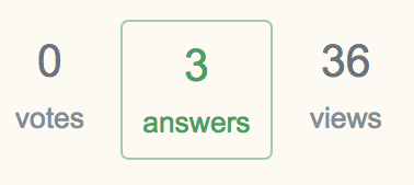
Rows are out of alignment

The numbers and the words of the middle set are out of line with the other pair:

bad old way

  • Notice how "answers" is on a different baseline from "votes" and "views".

  • Notice how the first 3 is on a different baseline from the second 3.

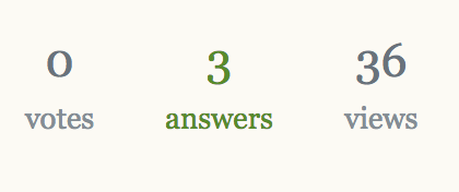
This is the way it is supposed to look:

good new way

  • Notice how "answers" is on the same baseline as "votes" and "views".

  • Notice how the middle 3 lines up with the 0 to the left and the 3 to the right.

  • And notice, of course, that the 3 has a descender the way it is supposed to, consistent with our site theme.

15

I don't like the new theme. This answer focuses on the main page, the primary purpose of which is to display a list of questions. For before-and-after visuals, please refer to screenshots from Mari-Lou A's answer.

  1. Subjectively: the main page looks like a data listing. It no longer feels inviting.

  2. The gratuitous borders around the 'answers' number and 'active|featured|hot|week|month' draw attention away from the question text-blocks, which should be the highlight of the page.

  3. The font has shrunk. This might be to accommodate the extra nav-column, but I just bought a larger monitor as a concession to my aging eyes. Shrinking the font isn't welcome.

15

I just wanted to repeat Andrew's recent observation, and mention there appears to be other design flaws

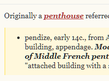
The quoted text on the NEW theme is... yellow? What shade is that? I wanted to indent the quotation, however, two thick vertical lines appeared and are very conspicuous. Is this deliberate?

enter image description here

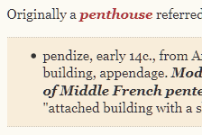
This is how it appears on the ORIGINAL theme. The extra lines are horizontal but very faint. The colour of the quoted text is more soothing to the eyes.

enter image description here

6
  • 4
    I don’t like the new color but I secretly prefer the thick lines for recursive nesting. Makes it easier to distinguish the quote level. That was harder before.
    – Dan Bron
    Commented Sep 2, 2018 at 15:27
  • 4
    @DanBron it's a weird vanilla colour, and it doesn't "pop" either. Neither did the original, but the transition was more harmonious, and made "sense", it's just a darker shade of the theme. With the site looking so flat, and the banner being smaller than the headings, I think perhaps it needs a new colour scheme. Something that tells the viewer this site is about "English". I'm not seeing it now.
    – Mari-Lou A
    Commented Sep 2, 2018 at 15:35
  • Agreed with all that!
    – Dan Bron
    Commented Sep 2, 2018 at 15:35
  • 1
    @DanBron "we're" doomed, there is nothing we can say or do, the new theme will be adopted. The "faults" are only aesthetic, the site functions as well as it did before. All the sites affected by the new theme look alike, seriously they do. We all belong to Stack Overflow.
    – Mari-Lou A
    Commented Sep 2, 2018 at 15:42
  • 2
    @JJJ the tasteful elegance that belonged to the "original" theme. Just compare the question titles between the "old" and "new" theme. Which one looks more pleasing, more harmonious, easier to read? If you tell me that the new theme looks cleaner and sleeker, you and I are not talking! :) I'm not joking.
    – Mari-Lou A
    Commented Sep 2, 2018 at 15:50
  • 4
    There's no longer a horizontal separator on the quotes. Given how very difficult it is to see the uncontrasty colorizing, this means you are now relying on this being immediately obvious only to people with youthful eyes using expensive high-contrast monitors who are viewing this in optimal lighting conditions. It’s discriminatory, and highly user-unfriendly. Yes, I’m perfectly serious.
    – tchrist Mod
    Commented Sep 3, 2018 at 14:19
14

The site logo is a little drunk:

Animate image of the site logo

(Made by Shog9)

14

More colours have been introduced unnecessarily. Quotes have changed colour:

New site Old site

Actually they have completely lost the ELU styling and gained the bog-standard styling. This is a retrograde step. But even if the style of a left bar had to be adopted, I see no reason to change the colour. After all, the background colour of the page is specific to ELU, so there is a site-specific style sheet.

And links have been underlined, although that might make sense for accessibility purposes. I can't see that introducing another colour into the site palette does that.

6
  • 2
    The color problem is even worse with highlighted questions, which are nearly invisible now. That's because the tagged-interesting.background-color has gone from #fffbec to rgba(255,245,222,0.7), which is a major contrast failure against our default background color. Compare old tag-interesting with new tag-interesting.
    – tchrist Mod
    Commented Sep 1, 2018 at 17:32
  • 1
    @tchrist I don't have any highlighted or ignored tags on ELU. Your comment is probably worth an answer.
    – Andrew Leach Mod
    Commented Sep 1, 2018 at 17:35
  • 1
    Will do, thanks.
    – tchrist Mod
    Commented Sep 1, 2018 at 17:35
  • 7
    I love the color contrast between regular text and block quotes in the old design. Especially in answers that quote old sources, I appreciate the suggestion of tanning in the warm but muted light brown screens around each quote. To my eye, the new block quote color (French vanilla with a hint of lemon) lacks a natural connection to the main background color and seems to have forced its way into the color palette like an insincerely cheery cold-call salutation.
    – Sven Yargs
    Commented Sep 3, 2018 at 19:39
  • 3
    On a separate note, I also agree with you that underlining links (many of which will be set in italics because they are book titles or words used as words) makes the links harder to read without conferring any countervailing benefit.
    – Sven Yargs
    Commented Sep 3, 2018 at 19:45
  • 8
    Underlining links is actually strongly recommended for accessibility purposes. This has actually come up here before, more than once; apparently, the site's existing theme makes links very difficult to notice for some folks, and underlining solves that problem. I don't much like the look of the redesign, but I will accept changes that make the site more accessible.
    – 1006a
    Commented Sep 4, 2018 at 15:11
13

‘Interestingly tagged’ questions tantamount to invisible

As a follow-on to Andrew’s observation that our colors don’t make sense now, I’ve found a related problem.

I have the old-english tag marked as an interesting tag, so that shows up in a distinctive color. What’s happened is that the tagged-interesting.background-color CSS value has gone from #fffbec before to rgba(255,245,222,0.7) now — so a #fff5de with a 70% opacity.

Under the old theme, that looks like this:

old theme interesting-tag highlight-demo

But under the new theme, it now looks like this:

new theme interesting-tag highlight-demo

The would-be “interesting” question is now virtually indistinguishable from the rest of them.

As I observed in another answer of mine, you must run contrast-analysis tools on your color pairings to know whether they are usable. This one is not.

This is a major contrast failure against our default background color, and cannot be seen.

5
  • 4
    W3C has a list of accessibility assessment tools that might be of use.
    – ColleenV
    Commented Sep 2, 2018 at 1:01
  • 6
    @ColleenV Thanks, I tried some of those. And as I suspected, it fails to have enough contrast for several of these elements. Most websites these days seem to be designed for 15-year-old eyes, not for 45-year-old eyes. Why they make poor contrast decisions (read that both ways :) which exclude a substantial portion of the world I don’t understand. Maybe it’s like including sounds only 15-year-olds can hear so their parents can’t tell what they’re listening to. :)
    – tchrist Mod
    Commented Sep 2, 2018 at 1:21
  • 5
    I would hope that any design would be tested for accessibility before being released and it's just because the change is still in "beta" that you're seeing these things. I gave up beta testing a while back - maybe it would be good not to just leave it to the young folks though lol.
    – ColleenV
    Commented Sep 2, 2018 at 1:32
  • 2
    Bigger issue here is the interesting questions color doesn't appear to be customizable for sites, which sucks on sites like Arqade where the yellow clashes against the blue and black design. It's even worse here because of your background color, so I have a little hope this might force them to revisit that decision.
    – Troyen
    Commented Oct 8, 2018 at 21:28
  • 1
    This is problematic for accessibility reasons and we're investigating better ways to indicate this for the entire network. Using color alone to indicate this questions is insufficient - as you say. Accessibility is a concern for us and something we're looking at moving forward.
    – Catija Staff
    Commented Dec 10, 2018 at 21:26
11

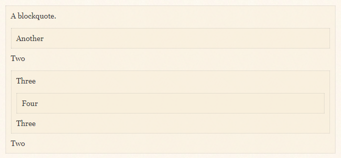
I agree with Mari-Lou A's comment about the new color of the block quotations being less attractive and less consistent with the background color than the old block quote color. Since the formatting of these quotations is being discussed, I also wanted to bring up an issue that I think existed before the redesign, but that I hope might be able to be fixed now: the indentation per level is too small, making it difficult to see it. (As tchrist♦ said in a comment, the line on the side which might be intended to provide another way of separating the blocks is very low contrast.)

I would like to see more indentation per level. I posted an answer earlier on about this, to a question that also received a helpful answer by Andrew Leach♦ suggesting that block quotations have borders on all sides, rather than just on the sides or the top and bottom:

Screenshot of nested quotes

2
  • 3
    I agree with this constructive comment. Another point that people have raised in the past (to no evident effect) is the inability of English Language & Usage to handle small caps. Enabling the site to handle small caps would be another functional improvement of the site's current capabilities.
    – Sven Yargs
    Commented Sep 4, 2018 at 23:34
  • 6
    @SvenYargs First we need to use a font that actually has small caps. Part of the problem is that Georgia doesn't have those. Another problem is that we constantly mix and match Georgia and Times New Roman when doing IPA, and it looks confusing because the weight and x-height differ, plus the style, too. A good solution to all this is to put the Google font "EB Garamond" at the front of our font stack, provided that we use text figures (aka old-style). The typeface's designer wanted those to be the default but having lowercase numbers freaked people out so Google changed the default.
    – tchrist Mod
    Commented Sep 5, 2018 at 0:53
11

I was rather hoping for something along these lines...

Suggestion for masthead

The tools I have available aren't professional-level and the font size might be adjusted in line with other sites in the SE family.

I do think that the textured border to the masthead is good, and it's a pity it's currently lost because the superfluous box uses it. There's a border to the heading; it's not necessary to add more. An unadorned title can happily sit left-justified as here, or centred if that's what the mobile theme does.

While I don't particularly like the new design philosophy (although it's still unstated, there's enough evidence of it around now) I do believe it's important to match it in its simplicity. But it's also hugely important — and, what's more, possible — to provide more than a nod to the heritage of the site in the design. I've looked hard online and not found the excellent original font Jin used, which would be preferred, so I've chosen something close in Letterpress Text. I'd like some image on the right of the header to match other sites (like Meta.SE, Music, Christianity and Academia, which I can see) but I don't think that text or book pages would physically fit well and still be obvious or legible. Perhaps it's possible to come up with something else.

8
  • If I had the tools available, I would do the following mockup: remove the poles, take the ampersand, enlarge, fade it considerably, and place it on the righthand side. I think that would work.
    – Mari-Lou A
    Commented Sep 16, 2018 at 7:42
  • You can't put it on the right-hand side, it doesn't fit with the apparent design standard.
    – Andrew Leach Mod
    Commented Sep 16, 2018 at 8:06
  • But Academia has a reduced version of their college campus image on the right-hand side. They also have the stylised books logo which tells visitors they not on Stack Overflow etc.
    – Mari-Lou A
    Commented Sep 16, 2018 at 8:21
  • 1
    Graphic illustration on the right; title on the left. Where the title is sort of graphic (like Music) it's still on the left, with an illustration on the right.
    – Andrew Leach Mod
    Commented Sep 16, 2018 at 8:24
  • Perhaps I'm not making myself clear. But in this post you ask …I'd like some image on the right of the header to match other sites… and I'm suggesting using the ampersand symbol as that image/graphic illustration, whatever it's called. The image/ampersand can be a watermark.
    – Mari-Lou A
    Commented Sep 16, 2018 at 8:40
  • Aha. Right. Yes, that could work.
    – Andrew Leach Mod
    Commented Sep 16, 2018 at 8:44
  • 2
    I like it. I've been imagining something like this, too, since it was suggested earlier here. The only illustration idea I've come up with is some kind of illuminated manuscript decorative detail—the horizontal, abstract floral kind. It could riff on the current fleurons, for continuity. I'm not sure if that's English-specific enough, though.
    – 1006a
    Commented Sep 16, 2018 at 19:22
  • 1
    Please repost your graphic restyling in 1006a's New Theme post. We need to make EL&U look enticing, friendlier and more inviting. Thank you!
    – Mari-Lou A
    Commented Dec 8, 2018 at 8:41
10

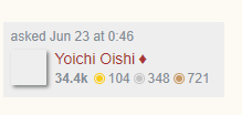
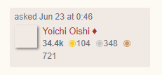
The post-signature owner grid is sometimes too small. I used this question for reference.

In the old theme:

enter image description here

In the new theme (notice how the 721 is not in line with the bronze dot):

enter image description here

9

It wasn't broken; why did you fix it?

4
  • 3
    Check out meta SE, this discourse has been ongoing for maybe a year. Not my downvote but...
    – Mari-Lou A
    Commented Aug 31, 2018 at 22:55
  • 2
    meta.stackexchange.com/questions/307862/… and stackoverflow.blog/2017/02/14/… It all started with Stack Overflow
    – Mari-Lou A
    Commented Aug 31, 2018 at 22:57
  • 3
    @JJJ If there is no forward component to your displacement vector, you could be moving sideways to no positive effect and great trouble and expense, and possibly to something you want to avoid. :)
    – ab2
    Commented Sep 1, 2018 at 15:35
  • 2
    Why? Well, that's one of the disadvantages of having engineers run the site. :P
    – Lawrence
    Commented Sep 13, 2018 at 14:27
8

Please don’t switch our question scores to the weird light-on-dark, blurry-and-bold “wrong-green-for-our-theme” boxes. This is a CSS problem that affects Macs but not Windows boxes. I write about this blurry-on-bold problem here, but the solution is:

To fix this, you probably need these bits of CSS for Macs:

-webkit-font-smoothing: antialiased;
-moz-osx-font-smoothing: grayscale;

That’s still the wrong color, though.

This was tasteful in the current theming that you’re trying to get rid of:

old demo of scores

But this in the new theme is quite ugly and perhaps even harder to read:

new demo of scores

(And yes, it really is this tiny, only about 12mm!)

Notice how very much easier it is to read the serifed word ”answers” there in the old theme compared to trying to read the sans-serifed word “answers” in the new theme. Flip back and forth between my two images: it’s obviously much worse now.

Also notice how in the new site theme, you’ve chosen a shade of green that has nothing to do with our site theme’s color palette. Too many colors makes things confusing and garish.

Even worse, by switching from the dark-on-light figures to light-on-dark, you’ve run afoul of the webkit font smoothing problem that makes light-on-dark text all bold and blurry on a Mac under webkit. I’ve mentioned this problem here on MSE. It looks completely awful.

I still don’t like that you’ve force-fed the wrong font on those score and view figures there, too. Proportional text figures are in keeping with our theme; tabular lining figures are not.

1
  • 1
    I agree with this complaint.
    – Robusto
    Commented Oct 24, 2018 at 13:41
7

Our design is too irresponsive

Our measure (line length) is still set far too long to be comfortably read on the desktop site. Short story is that the measure should be set between 40 and 70 ens, with 66 widely considered comfy. Ours seems to be set at 100, which violates all known page layout rules.

I’ve just posted about this on MSE because it’s a network-wide problem, not just ours alone. See this post on MSE for copious details and examples, including proposed fixes.

6

Constructive suggestion: consider removing the boxy outlines. They are drawing attention away from the important content.

Existing UI: Existing UI

UI under test: UI under test

2
  • 1
    This is part of the network-wide design and is fixed everywhere. Changing this isn't possible on a per-site basis.'
    – Catija Staff
    Commented Dec 10, 2018 at 21:18
  • @Catija Thanks for your note. Although the network-wide elements are frozen for now, it is heartening to know that someone (you!) is making an effort to connect with the community and our opinions constructively, actively seeking out what can be implemented fairly quickly. Glad they brought you on board when they did. Hiring you and Monica (and the other CMs, if they’re anything like you two) were some of the best decisions Stack Exchange made.
    – Lawrence
    Commented Dec 11, 2018 at 0:18
5

I just today opted-in to new beta designs, and now I see the new EL&U design everyone is griping about.

Maybe this isn't what you'd call constructive criticism, but: It's ... ugly.

screenshot of EL&U main with "opt-in to new beta designs" enabled

And I'm no design snob. I couldn't tell a Helvetica from a Garamond if they both bit me on the derriere. Which it seems like they have?

But, in the spirit of trying to suss out what's bugging me, and seperate it from the chaff of "I'm old, and I'm not happy. Everything today is improved, and I don't like it!", with high probability of duplication and overlap of prior gripes:

  • Is the EL&U banner supposed to be off-center like that?
  • Do we need the heavy ornamental box around it?
  • Do we need "TOP QUESTIONS" in 48,000pt font? Why is that information so critical?
  • Do the individual questions need to be so tall (i.e. big y value), so you can see so few at a time?
  • Is it intended the almost-static right sidebar needs to be so conspicuous, at the expense of the central focus of the site, the question list?
  • Do I need a huge box showing all my watched tags? I rarely if ever change them.

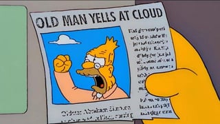
Old Man Yells at Cloud

On the plus side, I super-duper like the much clearer and more conspicuous *ask question" button, in burgundy. That is a fantastic change. You can leave that one on my lawn.

13
  • I upvoted yesterday but I didn't have the time to post comments. So, here they are: 1. Whaaaaat? You only found out yesterday how ugly the new design is? Did you not see any of the feedback posted weeks, months earlier on EL&U and meta? I'm really surprised by your tardy reaction. 2. Many of the points you raised, eloquently, have been mentioned by others. Catija ♦ addressed a few of them, e.g. {why} Is the EL&U banner ... off-center like that? “Because all sites must have this placement moving forward. The goal… is to make the base LESS/CSS for the entire network as similar as possible…”
    – Mari-Lou A
    Commented Oct 22, 2018 at 9:58
  • Do we need "TOP QUESTIONS" in 48,000pt font? according to the Community manager, it's all in the name of conformity and consistency. “The subheading sizes are standardized across the network. Initially, the logo was somewhat limited by length relative to height in order for the logo to fit on phones as small as 320 px wide. Sites with longer names will tend to have smaller fonts to accommodate this.” (Catija♦) My point being the CM had already "answered" some of your queries.
    – Mari-Lou A
    Commented Oct 22, 2018 at 10:04
  • Aaaaaand lastly, unfortunately the announcement does not show up on the front page so the number of users/visitors who will see your post will be very very low. As for the CM, I've heard she's expecting a baby any week now, so she'll have her hands very full for the next 6-8 weeks. (source: IPS meta)
    – Mari-Lou A
    Commented Oct 22, 2018 at 10:08
  • @Mari-LouA Thanks ML for the detailed and helpful comments. Yeah, I figured I would have duplicated a lot of earlier complaints. I’m not too fussed about this answer getting a lot of views / votes from others. It’s here if it’s helpful, the CM (congrats to her!) can use it if it adds any value. If not, we’ll, as you said, she responded to several of the gripes already. It’s too bad about the changes. The site looks so ... “function over form” now.
    – Dan Bron
    Commented Oct 22, 2018 at 11:48
  • @Mari-LouA PS: watch the “grumpy old man” SNL video I linked to. It’s funny!
    – Dan Bron
    Commented Oct 22, 2018 at 11:49
  • @Mari-LouA Aww, that’s a shame. Here’s a video from the same actor (Dana Carvey) playing the same character (Grumpy Old Man), but it’s a different sketch. I can’t find the same one on YouTube: youtu.be/vYmA0zPiVHY
    – Dan Bron
    Commented Oct 22, 2018 at 11:58
  • 1
    @DanBron SEE ALSO 1, 2, 3, 4, 5.
    – tchrist Mod
    Commented Oct 24, 2018 at 4:19
  • @Mari-LouA I’ve re-featured them; they may reappear. Or might not.
    – tchrist Mod
    Commented Oct 24, 2018 at 4:25
  • @tchrist Thanks! I had seen a couple of those. Now I’ll read the others over the next couple days (spread out so if I upvote them, which is likely, all the votes won’t be reversed as serial voting).
    – Dan Bron
    Commented Oct 24, 2018 at 11:48
  • @DanBron 6
    – tchrist Mod
    Commented Oct 25, 2018 at 13:00
  • @tchrist I had actually seen and upvoted that. I love that there’s a font which imitates ransom note cut n paste!
    – Dan Bron
    Commented Oct 25, 2018 at 13:03
  • @tchrist For your future use.
    – Dan Bron
    Commented Oct 25, 2018 at 13:15
  • Please post any graphic design restyling you may have in mind in 1006a's New Theme post. We need to make EL&U look more enticing, friendlier and more inviting. Thank you!
    – Mari-Lou A
    Commented Dec 8, 2018 at 8:43
4

There are many things I don't like about it, but there were many things I didn't like about the old one, too. You make do with what you have. At least I try to. I don't like complaining.
But there is one item of the new theme I'd like to complain about.
Maybe it was there on the old one, too -- I haven't looked.

That is the HOT META POSTS box on the right. I rarely look at either side -- that's where ads appear and I've gotten good at ignoring them on other sites -- but when I do look it's pretty damn silly.

3
  • 3
    Can you give an example of what you mean by an "ad" appearing in the Hot Meta Posts box? I'm not quite sure what you mean.
    – Catija Staff
    Commented Sep 7, 2018 at 19:15
  • Uh, just to make sure, you're...not actually complaining about the community bulletin board itself that has been there at that exact same place for years, are you? Commented Sep 18, 2018 at 9:33
  • No, it's the label, especially the concept of HOT META POSTS, that is ridiculous. There's nothing hot about organizational details. Commented Sep 18, 2018 at 15:20
4

Well, there's this (I assume this is a temporary bug, but lol so I had to post it)

enter image description here

1
  • @jjj I think it was Firefox on Windows 10 but I don't really remember Commented Sep 19, 2018 at 1:04
3

Could those ornaments which are now like galling cut-off Daisy Dukes with no legs, be extended in some way (hearts, clubs, horseshoes, hand-grenades?)


I think this is OK now, not sure it needs the extra line (it loads slower too, you might want to pack it up with the logo)

enter image description here

2
  • If you ro­tate them to the left 90 de­grees, they look like some mon­key emo­ji with a funky tie.
    – tchrist Mod
    Commented Sep 4, 2018 at 22:26
  • 1
    Rotate 90˚ to the right, it's a large person with elaborate hairdo, seen from behind sitting on the sand at a nudist beach. Or is that just a manifestation of my own issues... Commented Sep 12, 2018 at 22:53
3

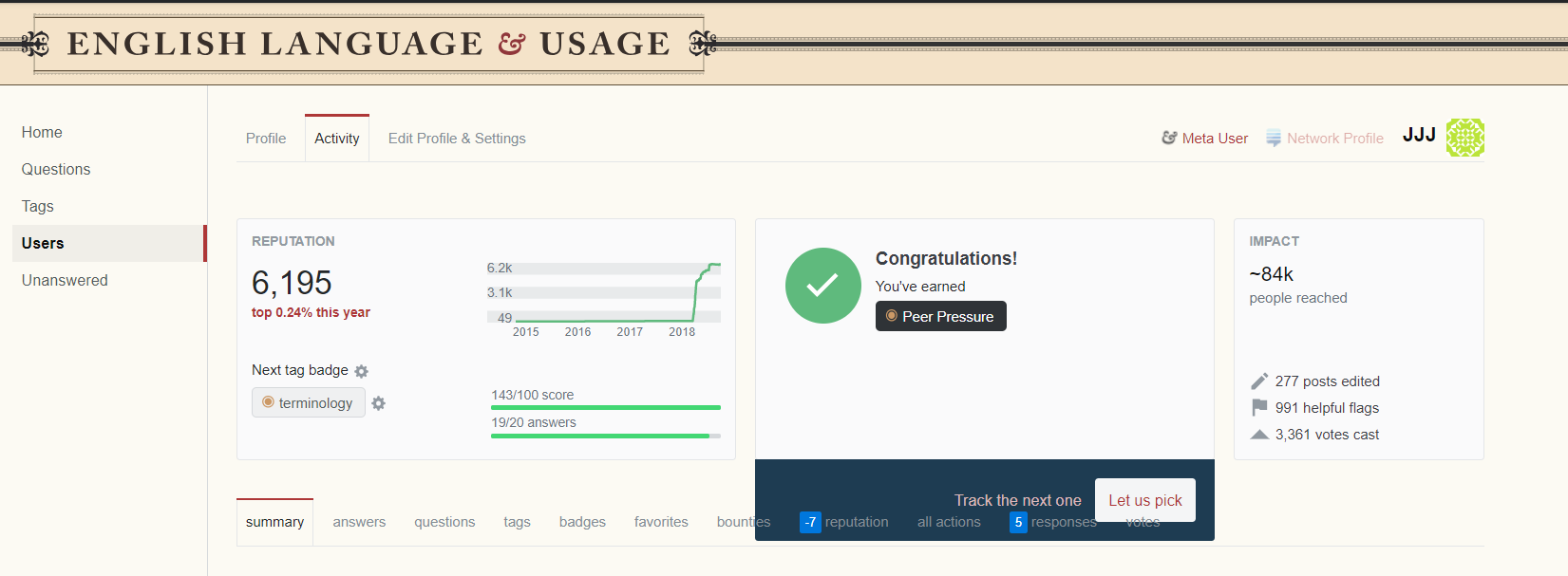
Badge tracking on profile page looks wrong (when completed). The track the next one and let us pick buttons (and their bounding box) appear too low and interfere with the tabs. enter image description here

On Meta it looks fine (but that could be because I haven't completed the badge task): enter image description here

2
  • 2
    Yeah, this isn't related to the new theme. It's a general bug... We're working on it. Thanks for letting me know!
    – Catija Staff
    Commented Sep 28, 2018 at 20:38
  • 3
    Here's the MSE report about it: meta.stackexchange.com/questions/316061/… I think this is the same concern. :)
    – Catija Staff
    Commented Sep 28, 2018 at 20:43
2

C A N   W E   H A V E   T H I S   B A N N E R ?

enter image description here

P L E A S E ?

I saved the web­page on my lap­top, and when I opened the file some­thing won­drous oc­curred. The thick black lines had dis­ap­peared, and the lo­go im­me­di­ate­ly ben­e­fit­ted. Without that tug-of-war pole, the whole lo­go looks un­fet­tered, it’s eas­i­er on the eye. Am I wrong?

More­over, I still dis­like the font used on “All Ques­tions”, it’s jar­ring. Why can’t we have the same font used in the ban­ner?

2
  • 1
    Yes, better. And I note the added realism in the screen shot of the inevitable red dot on the review icon. Commented Sep 16, 2018 at 7:40
  • Found it (the new answer). It’s a bit tricky on the phone - not sure how to do a page search. The horizontal bars seem to have disappeared from the ‘new look’ pictures, even on your old answers - at least, when viewed on my phone. First impressions: looks good.
    – Lawrence
    Commented Sep 16, 2018 at 12:25
1

It's an Improvement…

I still dislike the general layout, and I feel that EL&U would benefit from a different colour scheme but the logo does look much better now (centred would be best).

Thank you (the graphic team) for listening and fixing the logo.

Now visitors will clearly identify which site they are on. Here is a screenshot set at 110%

enter image description here

5
  • Yes, the title looks not quite left-aligned, even though it's properly left-aligned to the questions column. It looks like it's slinking away to the left, trying to escape (though, who can blame it for trying?).
    – Lawrence
    Commented Sep 13, 2018 at 14:37
  • You know what? Look at the part in your original answer where you circled the logo and drew an arrow to indicate where it should be. The logo has been shifted to the right about the length of that arrow. :P
    – Lawrence
    Commented Sep 13, 2018 at 14:41
  • @Lawrence please see the "new" serendipitous logo I happened to chance upon and tell me what you think. Which version do you prefer?
    – Mari-Lou A
    Commented Sep 16, 2018 at 7:38
  • Do you mean the one in your answer?
    – Lawrence
    Commented Sep 16, 2018 at 8:19
  • @Lawrence the new answer I posted, entitled in caps Can we have this banner?
    – Mari-Lou A
    Commented Sep 16, 2018 at 8:23
1

Sticky Site Banner

This isn't a bug per se, but while the programmers are working on the UI, would it be possible to keep the site banner (e.g. "English Language & Usage") in the top menu or left menu? Clicking on the banner is a natural way to return to the home page of the community.

Currently, the site name scrolls away when scrolling down the page.

8
  • 4
    The "home" button serves the same purpose in the left banner if you don't collapse it. It's actually my favorite thing about the left sidebar right now! :D I would love to see the text "Home" replaced with the site favicon and name, though.
    – Catija Staff
    Commented Sep 13, 2018 at 14:27
  • 1
    @Catija So it does! Yes, I'd like to see something like the little 'home icon' found at the bottom-right corner of chat rooms. Put it where the "Home" link is. It is a major identifying feature of the community, after all.
    – Lawrence
    Commented Sep 13, 2018 at 14:30
  • 1
    @Catija I hope that in general not too much relies on us not collapsing left nav. I expect almost all “power users” (ie regular users who realize they have the option to collapse it) will. It’s there to serve the needs of another audience. For most of us it’s just a waste of space.
    – Dan Bron
    Commented Sep 15, 2018 at 11:08
  • 1
    @DanBron I'm not sure I understand. Even when collapsed, all of the content is available in the drop down hamburger that collapsing it creates. Everything is still accessible, just in a menu.
    – Catija Staff
    Commented Sep 15, 2018 at 12:48
  • @Catija The point is that it takes two clicks to get to the Home page when left nav is collapsed. It would be nice to get to Home with just one click. Small point, but for regular users, such small irritations repeated multiple times daily can grow into a painful pressure sore... Commented Sep 16, 2018 at 7:55
  • 1
    @Chappo You can get to home with one click the same way you always could... click on the logo in the banner.
    – Catija Staff
    Commented Sep 16, 2018 at 12:57
  • @Catija That bring us back full circle: the banner scrolls away, so we need to scroll back up, then click on the logo. If the logo was shrunk and placed on the top menu bar, your logo-single-click idea would work. Do you think the programmers would consider doing this?
    – Lawrence
    Commented Sep 16, 2018 at 13:42
  • 1
    @Lawrence At this point, no. Putting it in the top bar makes the banner completely unnecessary, which would make it pointless for us to keep, which would further lead to complaints of loss of community identity for some sites because the sites would end up looking even more identical to each other.
    – Catija Staff
    Commented Sep 16, 2018 at 13:49
1

Also, this has bugged me forever, but can we have a link from a Meta question to the main site home? Clicking on the banner doesn't do it, and right now it's buried under the top-right hamburger menu.

1
  • 4
    You're probably better off making this a feature request on SE Meta as I imagine this "fix" would need to be implemented on all sites.
    – Mari-Lou A
    Commented Sep 20, 2018 at 5:40

You must log in to answer this question.

Not the answer you're looking for? Browse other questions tagged .